by Julia Workman
Project Type: End-to-end native mobile application concept for BrainStation
Platform: iOS
Year: 2022 (10 weeks)
My Roles: UX designer, creative director, system designer
Tools: Figma, InVision, Otter.ai, Zoom, Excel
QUESTION
How might we make it easy for social media creators to collaborate?
For social media content creators, collaborations with other users in similar or adjacent niches can be a lifeblood for increasing exposure, follower numbers, and generating revenue.
But there are barriers to effectively and efficiently identifying the best matches for collaboration.
1. It's competitive. There are a large number of content creators on social media, making it difficult for individual creators to stand out and get noticed by others.
2. Algorithms often ignore them. Social media algorithms can sometimes prioritize content from established creators or those with large followings, making it harder for smaller or newer content creators to get their content seen by others.
3. Niche communities are spread out. Some content creators focus on specific niche topics, which can limit the pool of potential collaborators.
Social media is a fast-paced and constantly changing environment, and success requires creators to be proactive and proactive in seeking out new opportunities. It takes time and enegry that most users feel is better spent elsewhere.
Collabs is a service that streamlines the process of discovering appropriate collaborators.
CHALLENGE
The first concept did not land well with users; a pivot was necessary.
The first conept was an AI-enabled analytics tool. It didn't address users' true goal.
A matchmaking app, a la Bumble/Tinder/Hinge, turned out to be a better model.
BACKGROUND
Aspiring social media influencers struggle to find the spotlight.
Over the past decade, I've watched social media become a huge part of everyday life. I personally have many peers who dedicate their professional careers to posting content on social media and building online communities.
I'm fascinated by the rise of this new career path, and I can't help but wonder, what does it take to succeed? How does one become influential enough to be considered "an influencer"?
More than half of the world’s population uses social media. It’s become an indispensible set of free tools for businesses and individuals who want to establish a brand and cultivate online engagement.
"Influencer" is a term that was virtually unheard of before the 2010s, but now ranks as one of the most desired career paths for young adults.
Unfortunately, if you have less than 10,000 followers, your content regularly reaches less than 5% of that audience (source). That's much less than the Organic [unpaid] Reach Rate of 10-20% that marketing experts say is ideal for platform growth.
What strategies can individual users employ to increase visibility and engagement on social media?
FACTS & FIGURES
The majority of social media users' content doesn't have a wide reach.
Nearly half of all users have between 1k-10k followers. There is a large potential market for solutions tailored to the needs of this group.
| Social Media Users by Follower Count | |
|---|---|
| Number of Followers | Portion of Users |
| 0-1k | 9% |
| 1k-10k | 48% (Micro-influencers) |
| 10k-100k | 19% |
| 100k-1M | 18% |
| 1M+ | 4% |
It's harder than it used to be for social media users to reach audiences organically.
Over the past few years, Organic Reach Rates (as measured by Iconosquare & Hootsuite) have declined. There are several theories as to why this occurs, but generally speaking, it is known to be due to the algorithmic priority given to paid content, and content from accounts which are already popular.
| Average ORR on Instagram for Micro-Influencers | |
|---|---|
| Year | Percentage of Followers Reached |
| 2020 | 6.8% |
| 2021 | 5.6% |
| 2022 | 4.6% |
Organic Reach Rate (ORR) = Number of People Reached/Total Number of Followers.
RESEARCH PLAN
I conducted interviews and surveys to determine how I might help users develop their social media accounts.
- Objective
To determine the nature of barriers and constraints preventing micro-influencers from realizing goals for their personal brands on social media. - Participant Criteria
Millenials and Gen Z (the largest groups on social media) who have 1k-10k followers on at lease one platform, post at least twice per week on average, and self-identify as "building a personal brand." - Constraints
As per project guidelines, the solution must be a mobile application, and the MVP must be presentation-ready in 10 weeks. - Assumptions
I assumed that micro-influencers' primary goal was to gain followers. I assumed that a digital solution could help them achieve their goals. I assumed that there was something lacking in their current experience(s) on social media.
METHODS
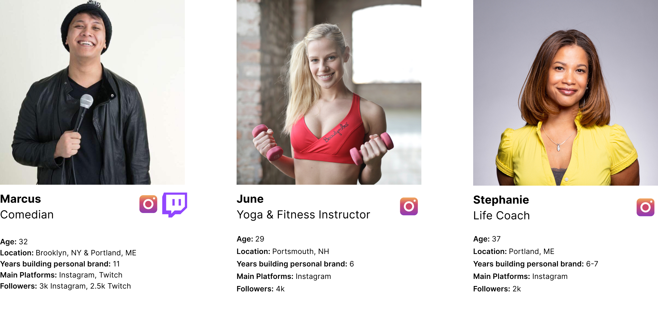
I conducted in-depth interviews with 3+ micro-influencers, and sent an email survey to 7 more.
I recruited participants via Instagram, LinkedIn and Facebook. This recruitment strategy allowed me to verify publicly available details about the individuals before interviewing them.
INTERVIEWEES

ANALYSIS
Working in FigJam, I used an affinity diagram to analyze qualitative data.
SYNTHESIS
Authenticity is the way to followers' hearts.
This group of users is aware that their followers want to see their "real lives." 100% of my interviewees expressed feeling conflicted when it came to opportunities for brand partnerships and sponsorships for this reason. They value having creative control over their content, and don't want to be seen as salespeople.
Influencers struggle to draw boundaries between work and play.
These users often find themselves undertaking activities on social media that blur the lines between work and leisure. This often makes it difficult for them to gague exactly how much time they spend working. It also leads them to question their behaviors and interactions across apps and platforms. As Marcus put it: "Am I talking to my friends, or am I representing my brand?"
They feel lost when it comes to brand strategy.
They are aware of common strategies used to gain followers, but there is confusion as to which strategies have the best effort-to-payoff ratio. There is also confusion over what to do with information provided by in-app analytics tools.
These users tend to have an idea of what most people with large followings have done to get there. However, for a litany of reasons, they tend to be unwilling or unable to follow suit with these methods. They are aware that in-app analytics provide information on their followers' behavior; however they report feeling helpless to affect the behavior of their followers because they believe that the app's algorithm is mostly dictating who sees which content.
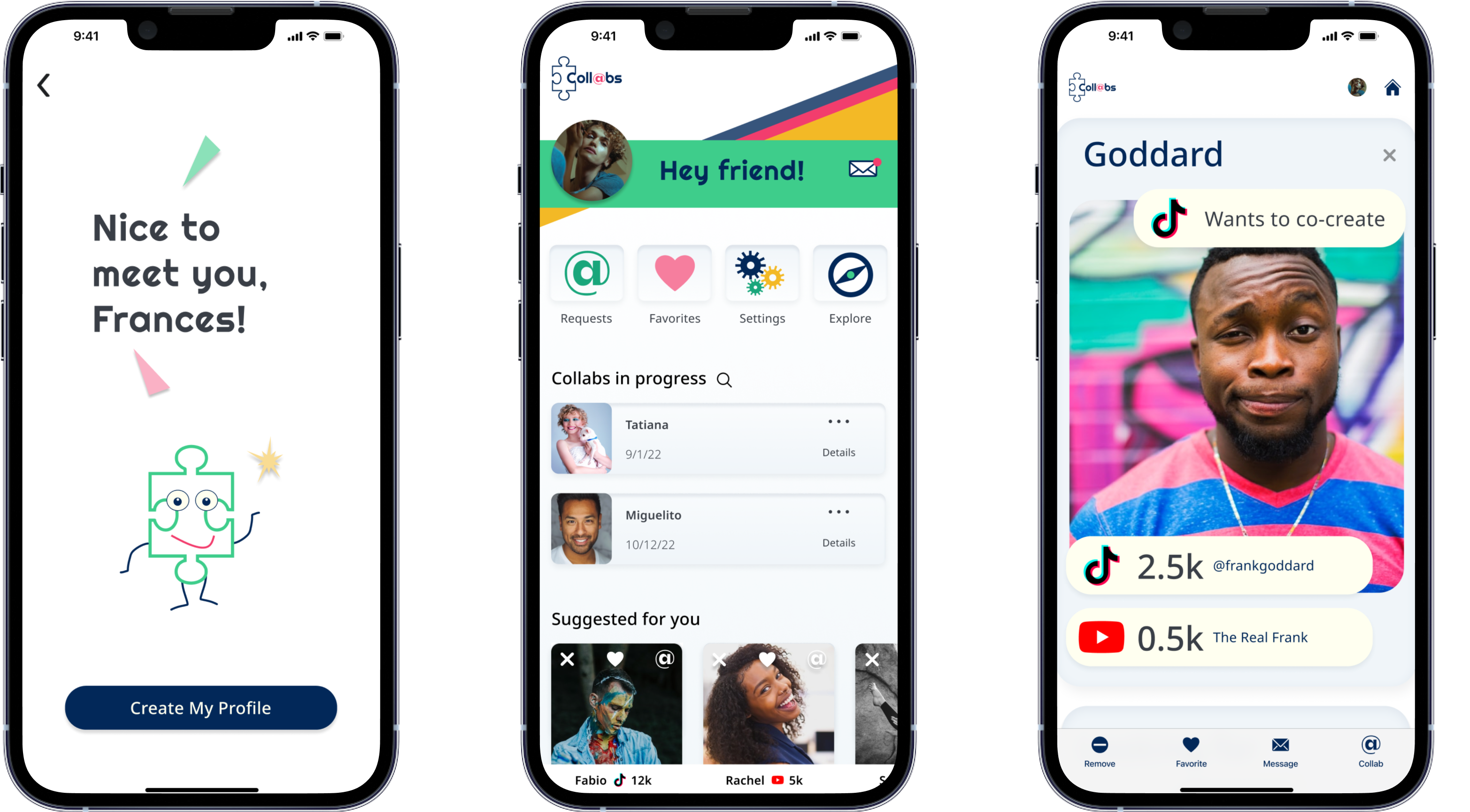
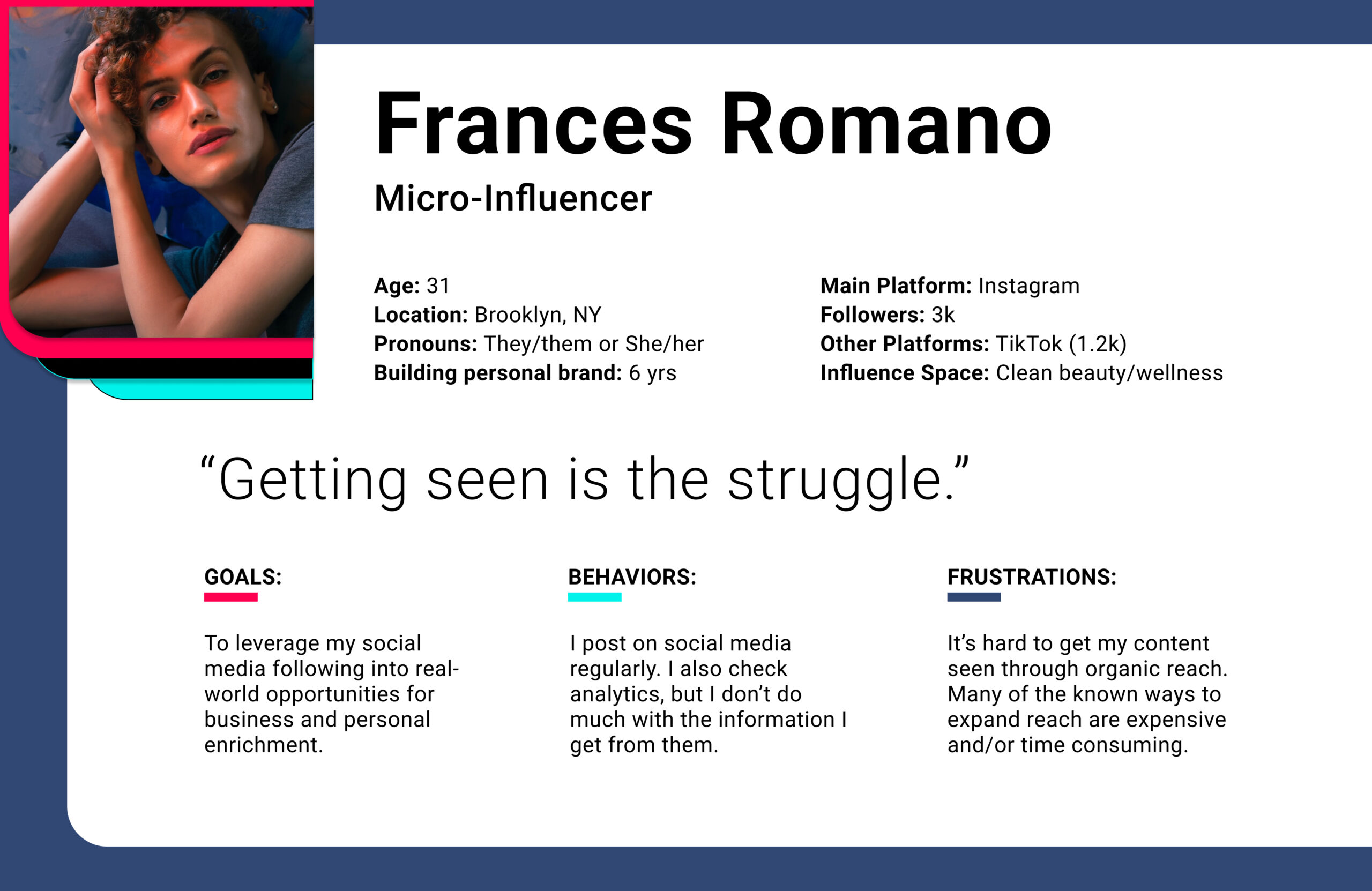
PERSONA
"I know they're out there...they just need to find me."
I realized that it wasn't just that these users weren't gaining followers. They weren't gaining the right kind of followers, and they struggled to come up with ways to get their content in front of the people with whom it would resonate best.
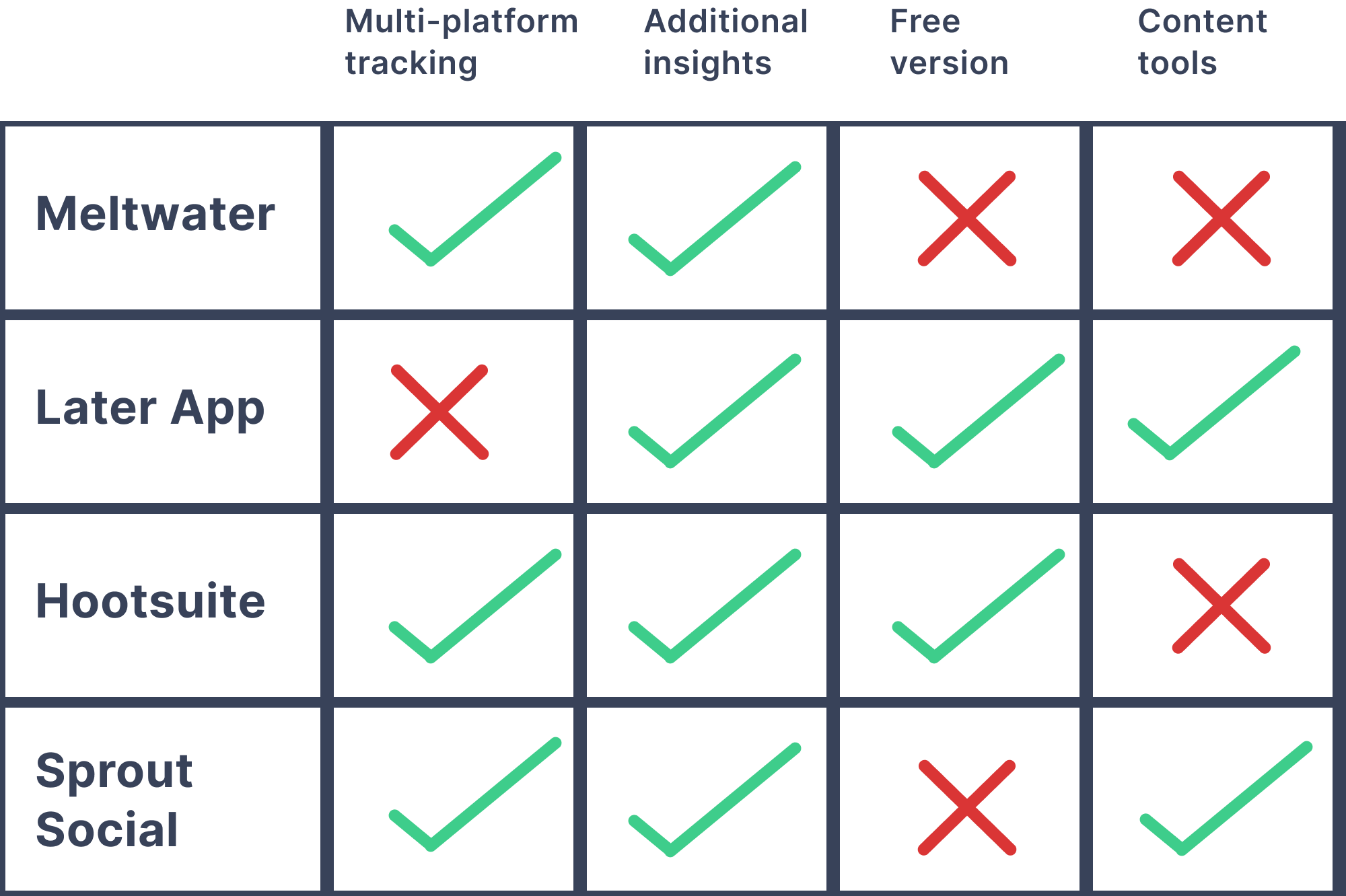
COMPETITIVE ANALYSIS
None of the existing content management tools combined:
- Multi-platform tracking
- Content creation templates
- Accessibilty to growing creators (i.e., free).
HOW MIGHT WE...
Help users translate multi-platform analytics insights into a strategy to increase reach?
Tools providing AI-generated insights from analytics already exist (Google Analytics for example), but all the data can still be intimidating. What if I could simplify the insights even more?
Product Concept #1:
"Smart suggestions" centered around users' goals for their personal brand.
AS AN INFLUENCER, I WANT TO...
See suggested actions that could help me connect with a wider audience.
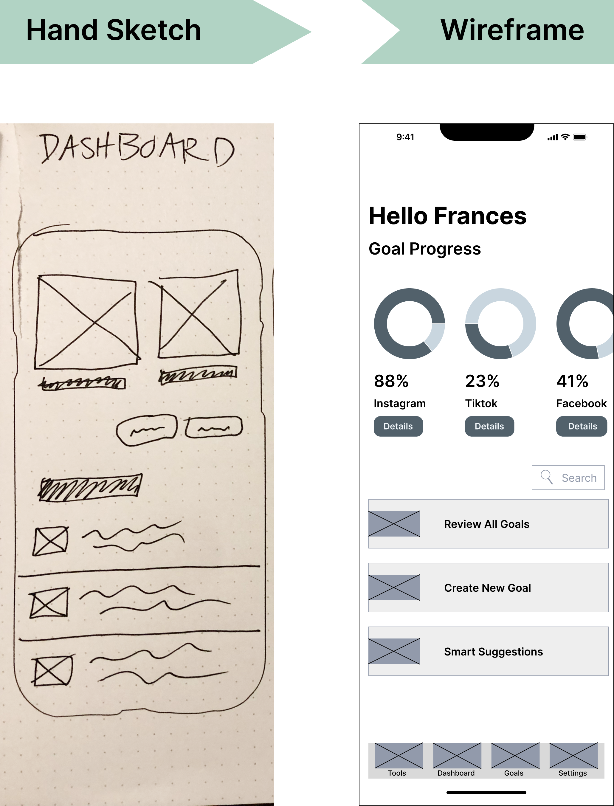
My users needed help figuring out how to apply the information gained from analytics. My first design was a dashboard that integrated analytics across multiple social media platforms.
Main Feature
AI-generated suggestions ("smart suggestions") tailored to their personal goals, which they would input during onboarding.
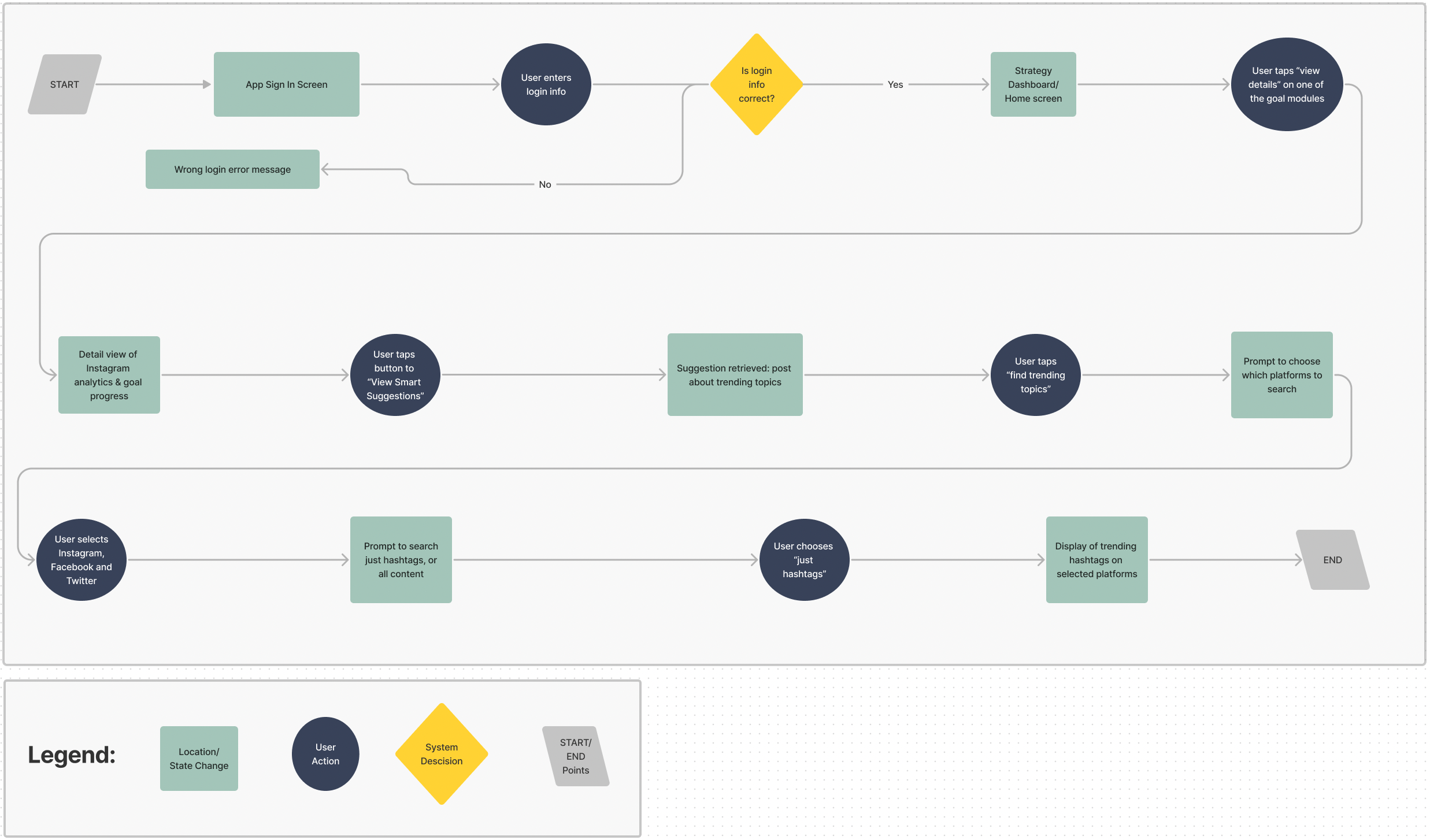
WIREFRAMING
I started sketching ideas based on typical mobile information displays.
The dashboard layout was developed after research on existing dashboard UI, and how similar information is successfully displayed on other data-heavy mobile applications.
In particular, investing/banking and fitness tracking apps were reviewed for inspiration.
USER TESTING: SMART SUGGESTIONS
Remote moderated user testing was conducted with 5 micro-influencers.
100% of users easily understood the information architecture.
80% of users were skeptical about AI-generated suggestions.
0% of users were enthusiastic about the analytics integration.
60% of users said they would like to see the profiles of content creators with similar stats to their own.
A NECESSARY PIVOT
The product was usable, but the solution didn't "spark joy."
The results of the first round of user testing indicated that I had not correctly identified the core yearning of my target group. My users did need help increasing content reach, but they weren't excited about using an analytics dashboard.
- They didn't trust A.I. to predict how their content would perform.
- They were more interested in connecting with similar users than in diving deeper into their own analytics.

Product Concept #2:
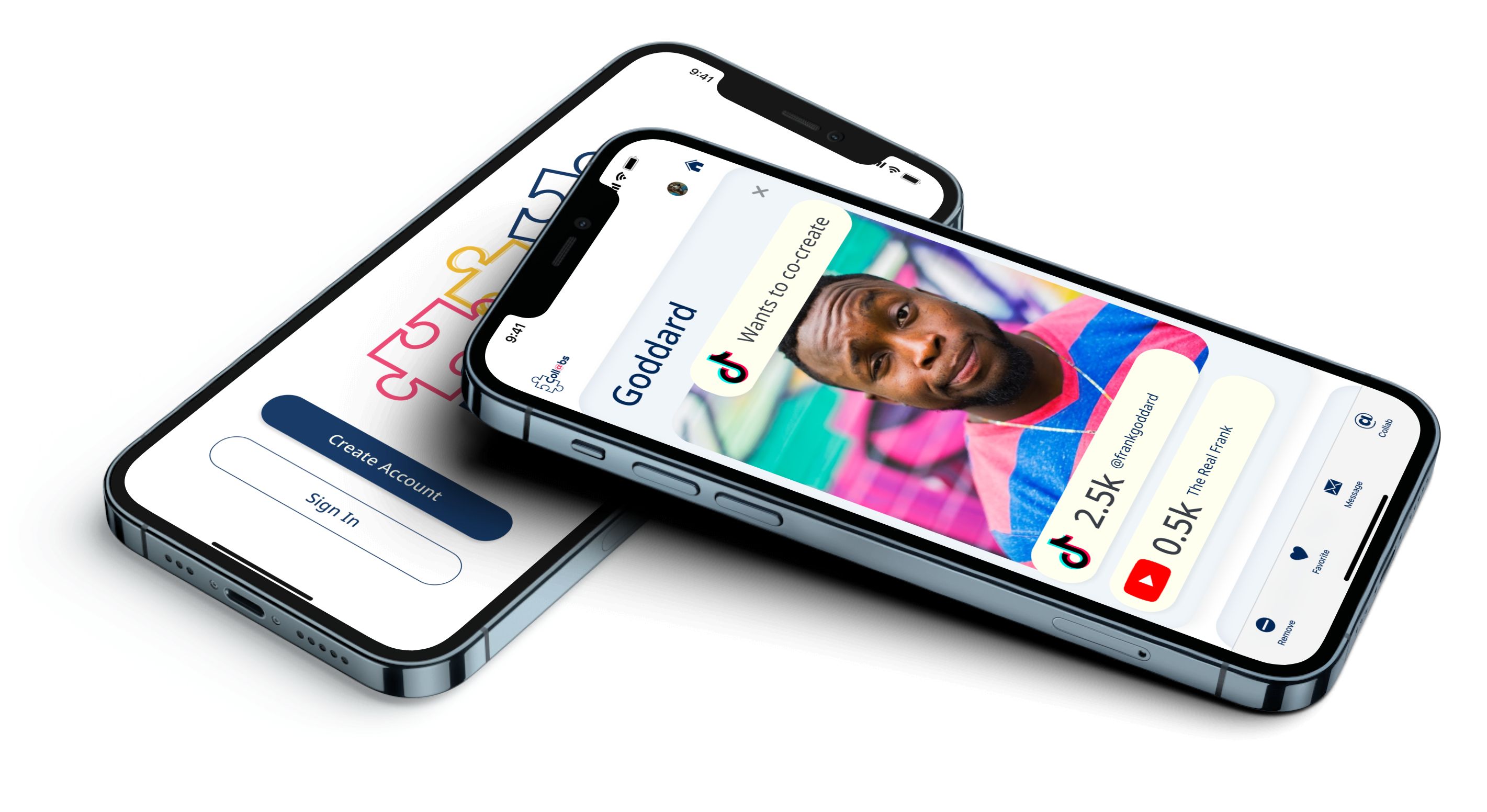
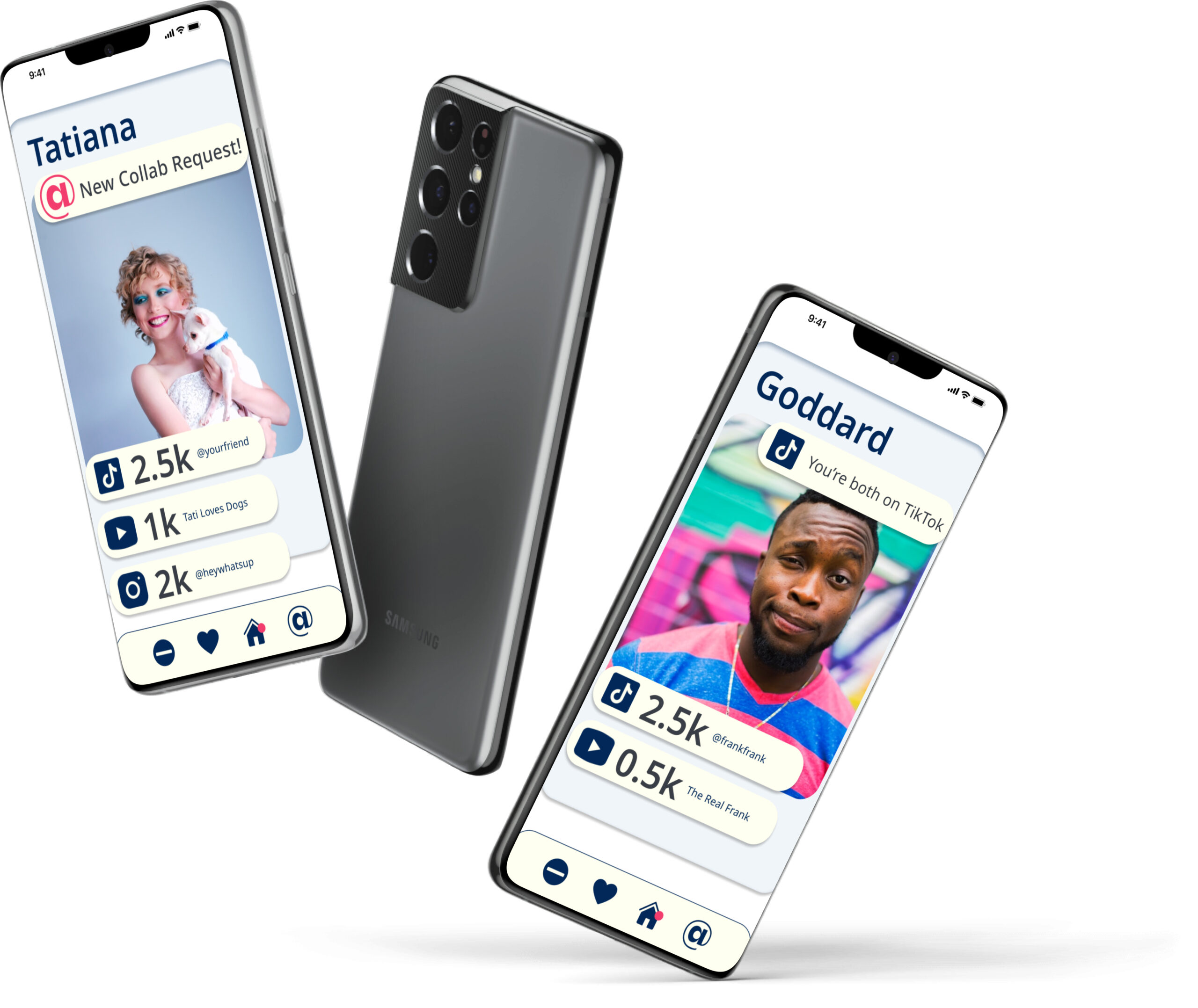
"Matchmaking" app (a la Tinder), for facilitating creative collaboration between micro-influencers.
USER TESTING: MATCHMAKING
While there were some usability issues, users were visibly more excited about this product than the previous one.
100% of users found the concept intuitive, due to the similarity to dating apps.
100% of users were confused by steps in the onboarding process.
80% of users were excited to quickly and easily identify collaborators.
60% of users preferred upward swipe interactions.
DESIGN DECISIONS
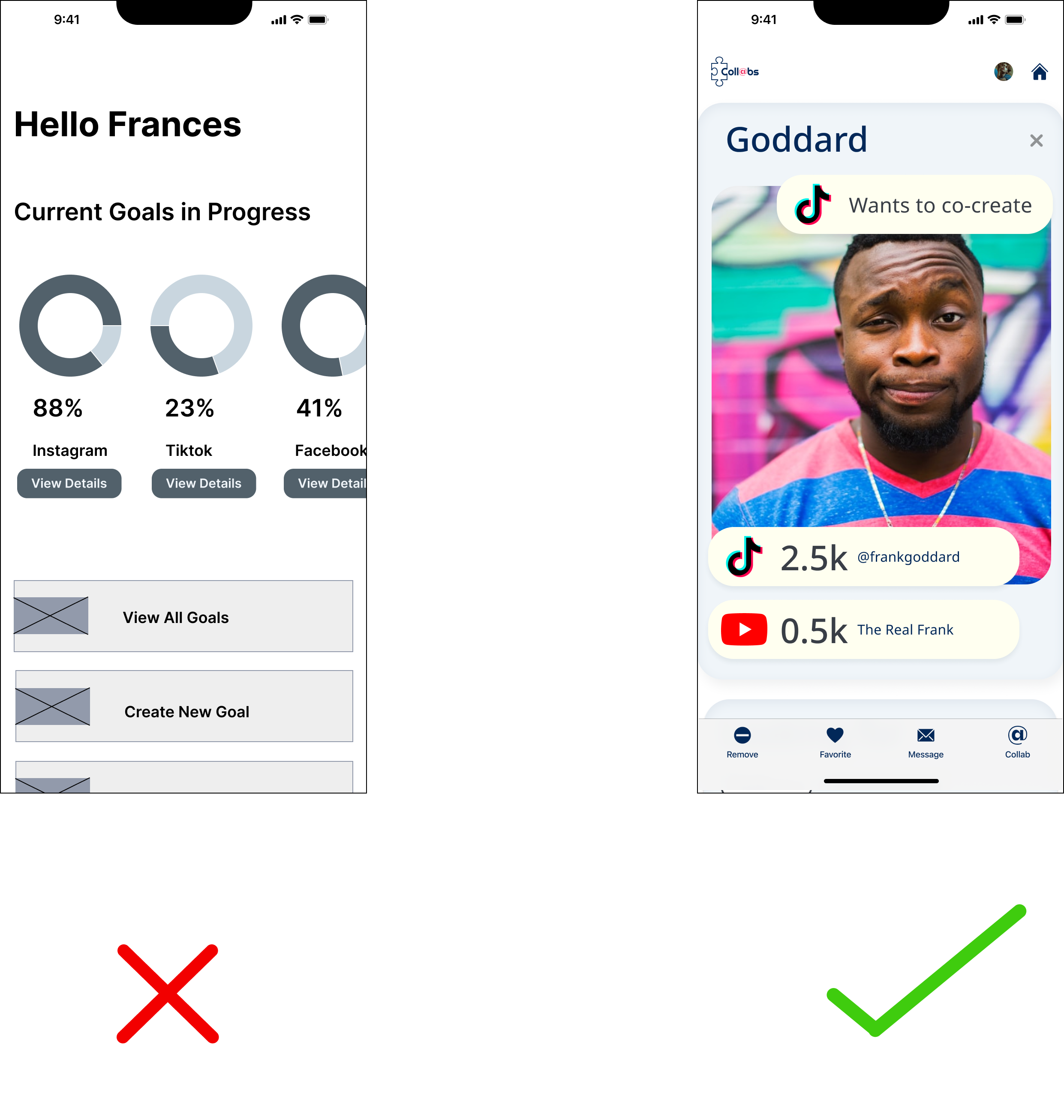
Profiles were optimized for quick decision-making.
During user testing, I found out which information was most important for users to see.
Users wanted to see:
- Photo of the person
- Number of followers
- Active platforms (YouTube, Tik Tok, etc.)
- Why they had been matched with them
I also did further UI/UX research on similar task flows in dating apps such as Hinge and Tinder.
ONBOARDING
A 50% reduction in onboarding flow steps was achieved.
While it is important for an app like this to collect detailed data about users during onboarding, I had to ensure that the process wasn't onerous or confusing.
Reducing the number of onboarding steps improves the experience by making it quicker and easier for users to start using the product. It is well-known that a streamlined onboarding process can lead to higher engagement, faster adoption and better retention rates, ultimately increasing the chances of user satisfaction and customer loyalty. A simplified onboarding process can reduce frustration and confusion, leading to a more positive first impression of the product.
The decisions on which steps to cut or simplify were made based on a prioritization matrix of potential changes extracted from research insights.
ONBOARDING VERSIONS
Research-based iterations honed in on the functionality and look that best fit the product.
In Version 1, I had the user choose their "brand space" and "desired collab space" on the same screen. I also had the Continue button at the top of the screen. Users missed the CTA and the "collab space" option in this design.
In Version 2, I put these tasks on separate screens and moved the button to solve the problem of users missing these elements. I also eliminated the "max" requirements; this had been my idea for keeping the profile interface from becoming too cluttered. However, during testing, users had expressed that the limits caused undue stress.
In Versions 3 and 4, after synthesizing my notes from user testing, I realized that having the user select their "brand space" was superfluous. Users had expressed interest in seeing matches based on the possibility of collaboration in a certain space; whether or not they already considered themselves to be a part of that brand space was irrelevant to them. I streamlined the onboarding process by cutting out the "brand space" selection. I also changed the language from "space" to "categories." This was a result of my UI research, and realizing that no apps that were popular with my target users contained the term "space." "Categories" is a term that appears commonly.
PROFILE VERSIONS
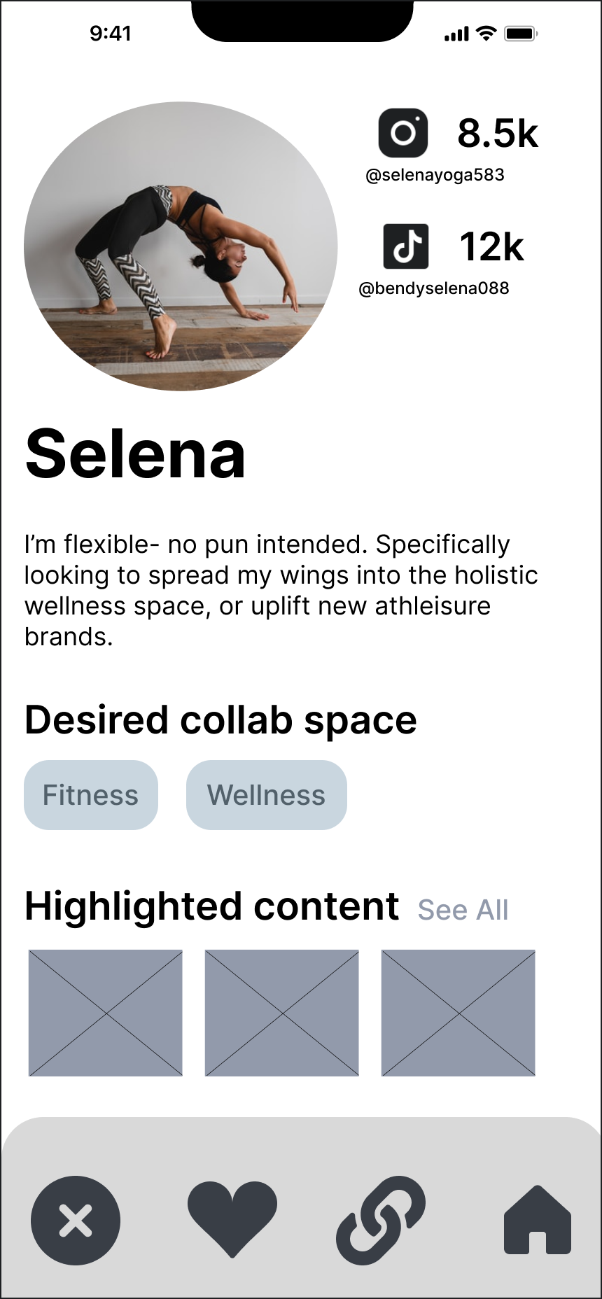
Profiles evolved to resemble the layout used on dating apps.
Users swipe through the profiles of users they have matched with based on the compatibility of their goals and interests, and the preferences specified by both parties.
The information on the profiles needed to be optimized for scanability.
During testing, users described their expectation of being able to swipe through profiles and gain the information they needed "at a glance," a similar experience to apps like Tinder.
In Version 1, I had no idea which information on the profile would be the most important for users, so I gave all of it essentially an equal amount of real estate.
By Version 2, I had learned that the top pieces of information that users wanted to see were: the user's picture, follower counts, and which platforms they were on. The desired categories for collabs, and social media content were next on users' list of priorities. After looking at some dating apps, such as Hinge and Tinder, I realized that for an app that fit this mental model, users were accustomed to seeing a large photo with a few relevant pieces of information at a glance. This layout has proven effective for helping users sort through many options quickly and making decisions based on information that they consider relevant.
Versions 3 & 4 featured a user profile that looked more like a dating app, and I also changed the look of the home menu bar after asking users to view the app on their mobile devices, because the consensus was that it was disproportionately large and visually distracted from the profile.
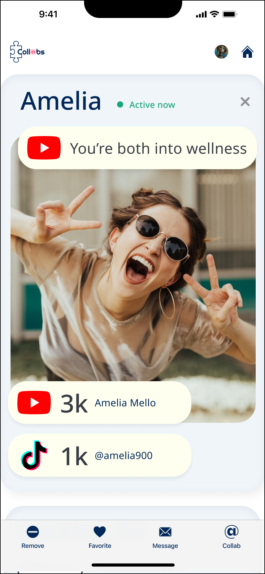
Version 5 I added banners at the top with quick information on why the match was chosen for this user. All of these changes were designed to increase efficiency of information discovery and cater to the user preferences discovered during testing. I also changed the navigation in accordance with HIG standards.
INTERACTION DESIGN
Users said that swiping right reminded them [too much] of Tinder. An upward swipe felt more intuitive.
Users pointed out that they were accustomed to swiping up to see new content on social media. I changed the profile interaction from a right swipe to an upward swipe in order to match expectations and reduce cognitive load.
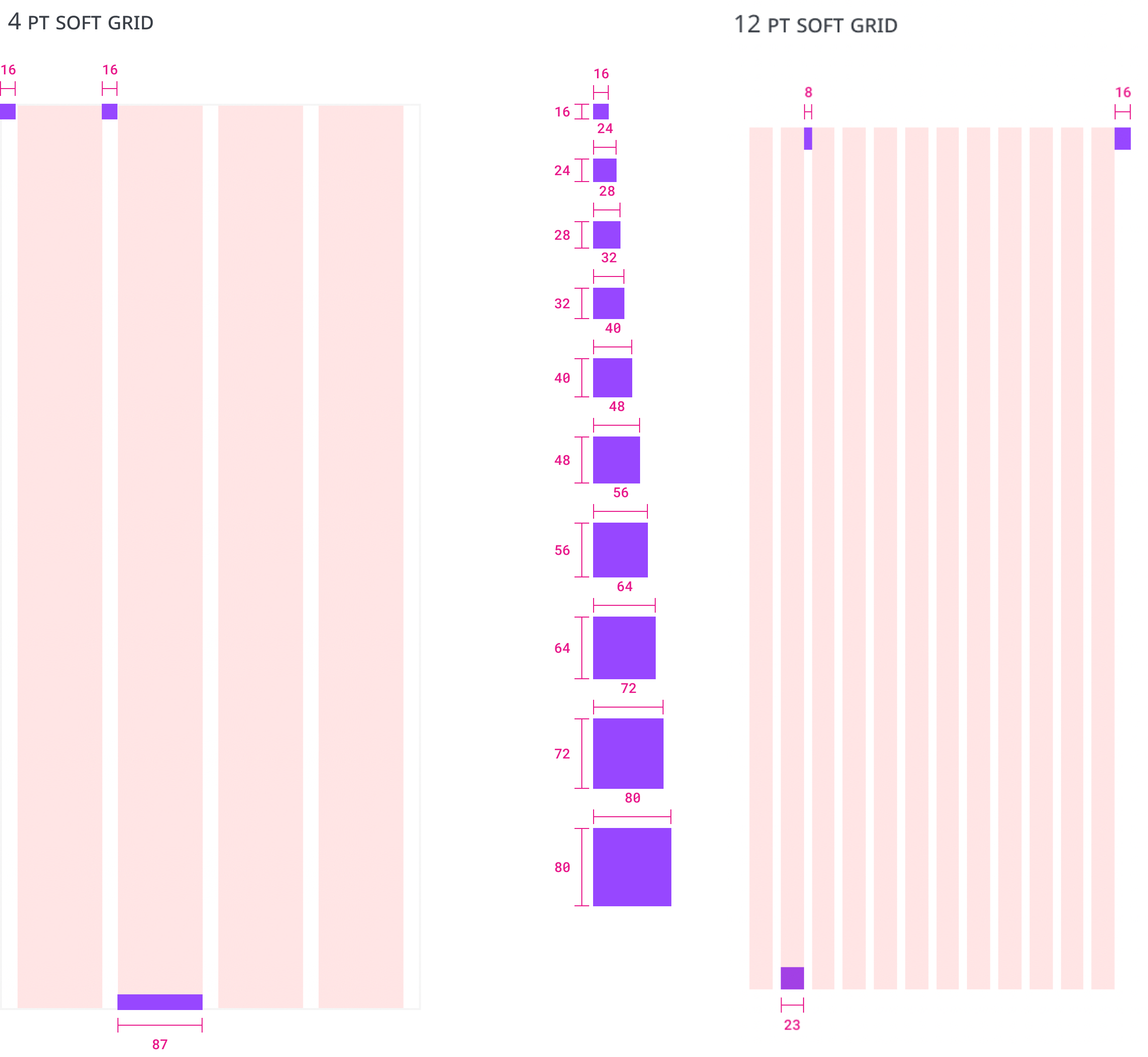
DESIGN SYSTEM
My atomic system was entirely proprietary and guided by Apple's HIG.
Depending on the layout and elements on screen, I designed on either a 4-pt or 12-pt soft grid, along with custom horizontal spacers.
From the beginning, I conceived of my interface elements in containers and columns, mimicking the way it will be constructed during development.
VISUAL IDENTITY
Bold colors juxtaposed by plenty of white space balanced playfulness and refinement.
The app needed to appeal to Millenials and Gen Z, because they are the majority of social media users, and they were my test users.
Bright palettes are used by brands in a similar market space such as TikTok, Instagram, Twitch, Tinder, and Spotify. However, I wanted the brand to avoid feeling too whimsical or edgy. Collaborations can involve money and contracts in some cases, and my users valued authenticity- it needed to be trustworthy
TYPOGRAPHY
- Visually Accesible
I consulted a published NNG guide on the readability of various fonts. - Not All Work, Not All Play
To determine whether the typography fit this criteria, I considered the current cultural associations of a list of 5 highly readable typefaces. What other brands used them, or similar typefaces?
STYLE TILE
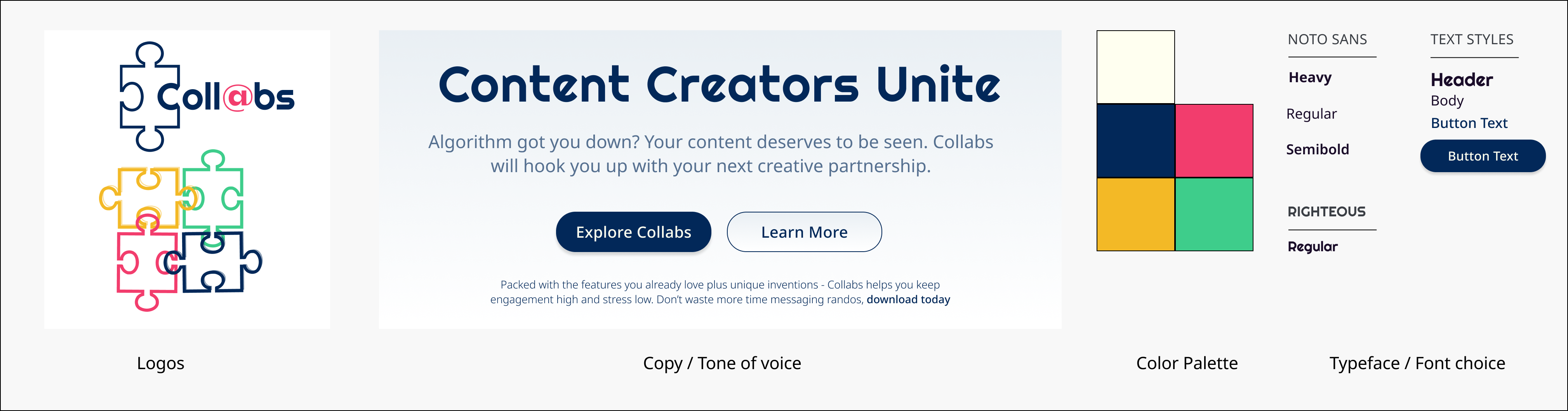
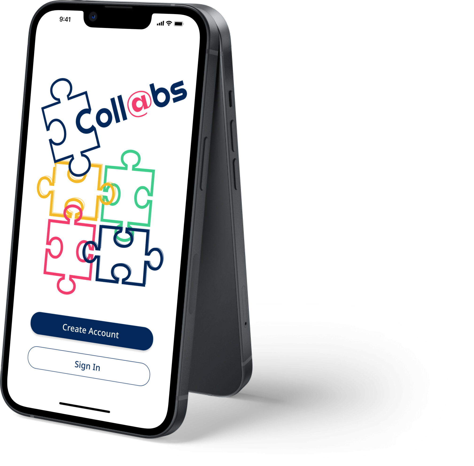
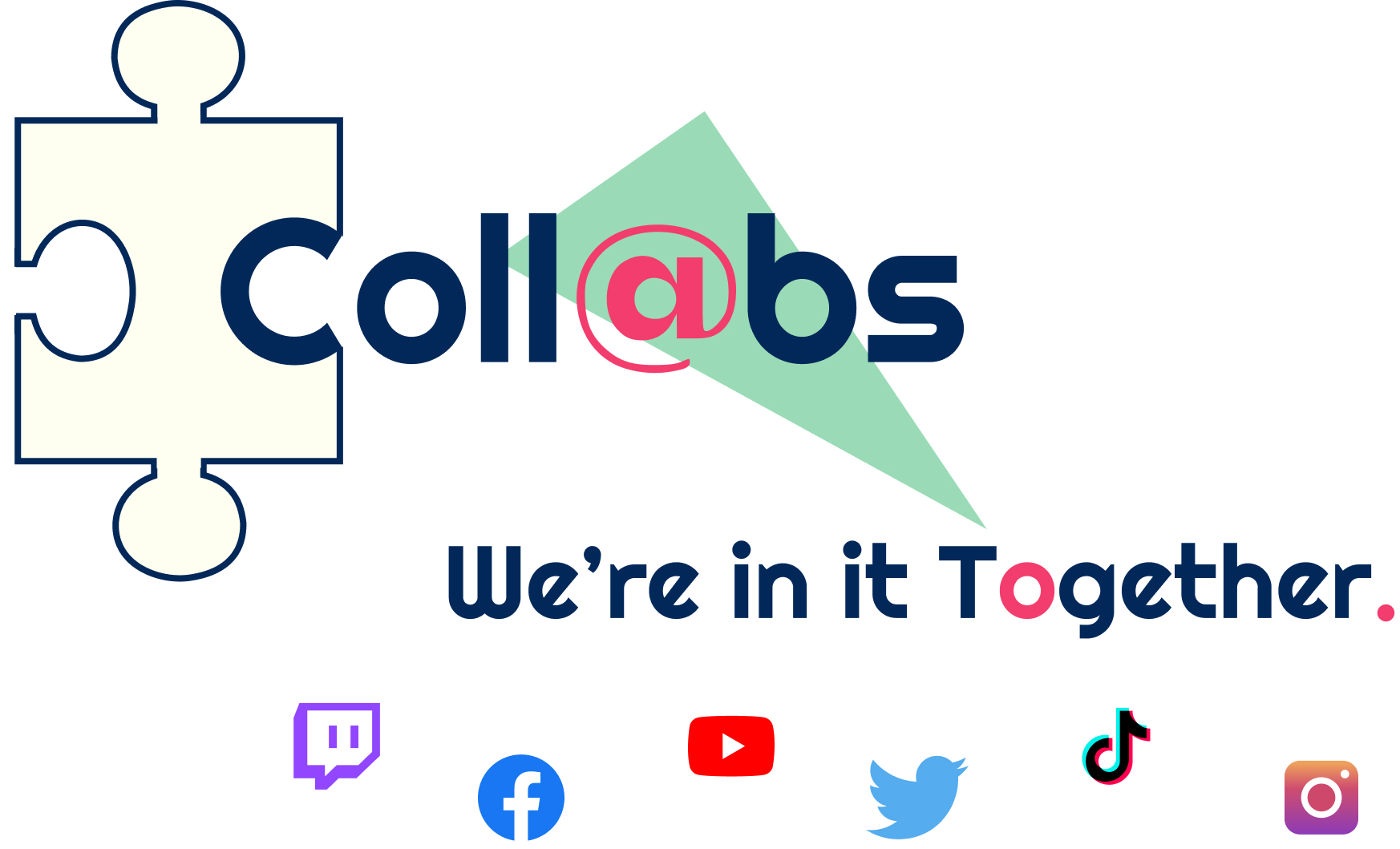
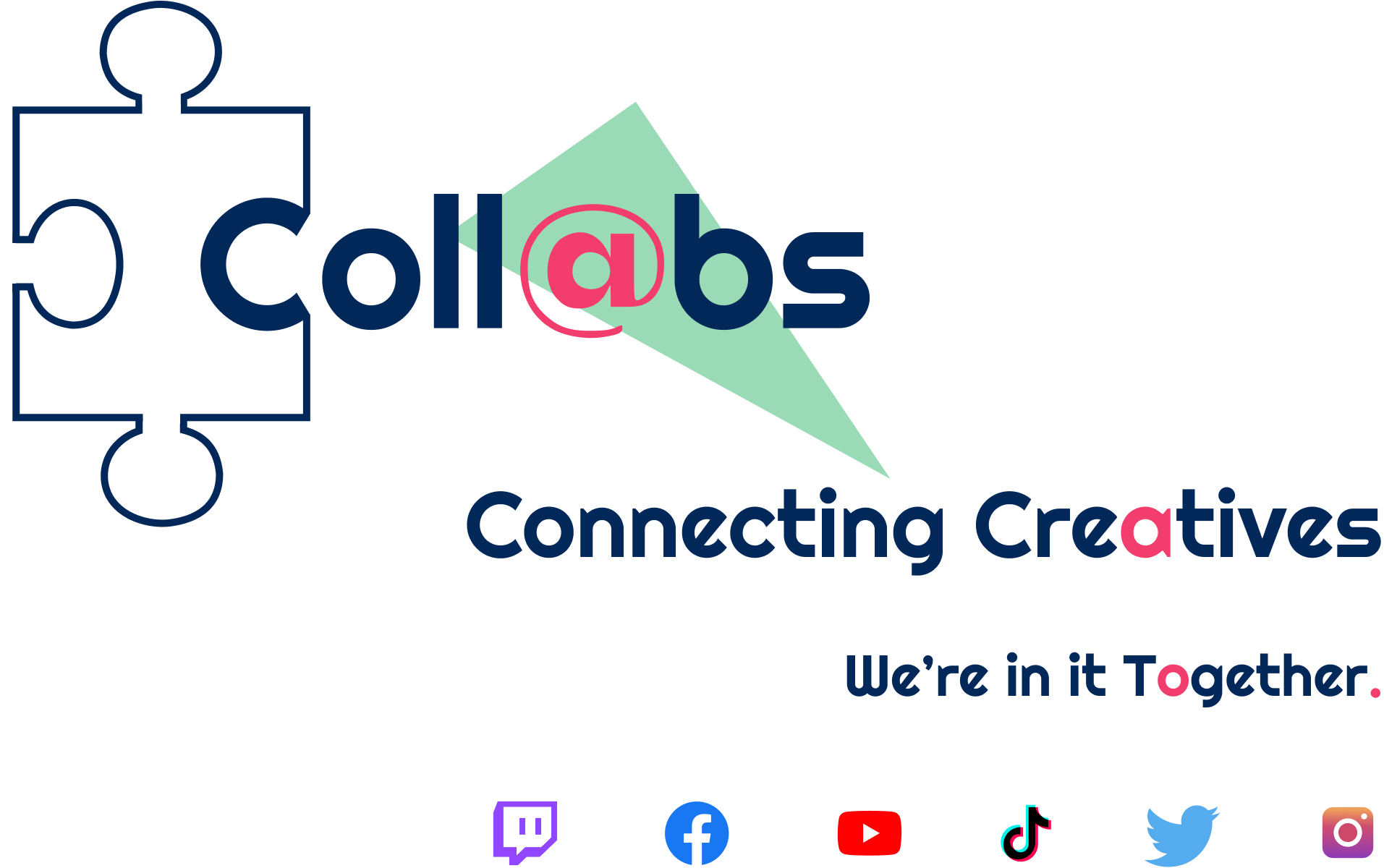
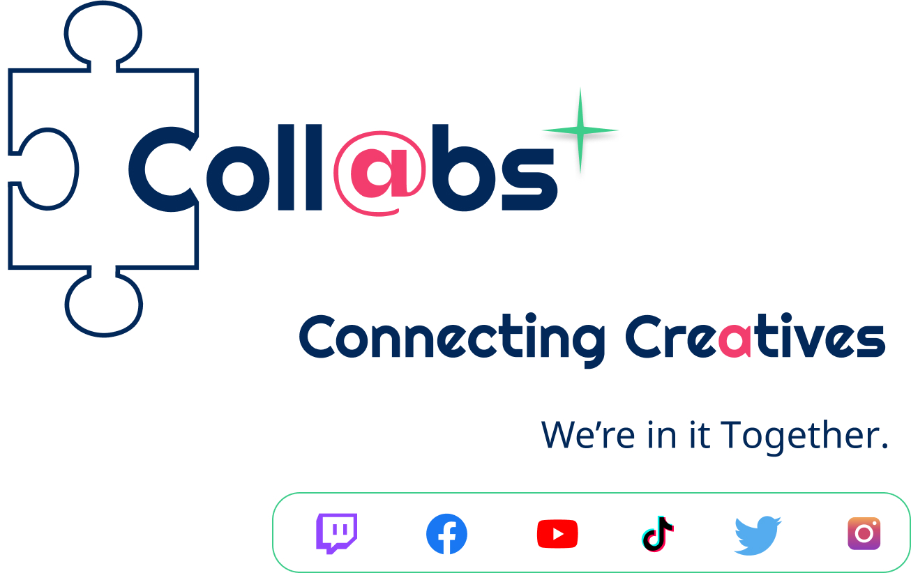
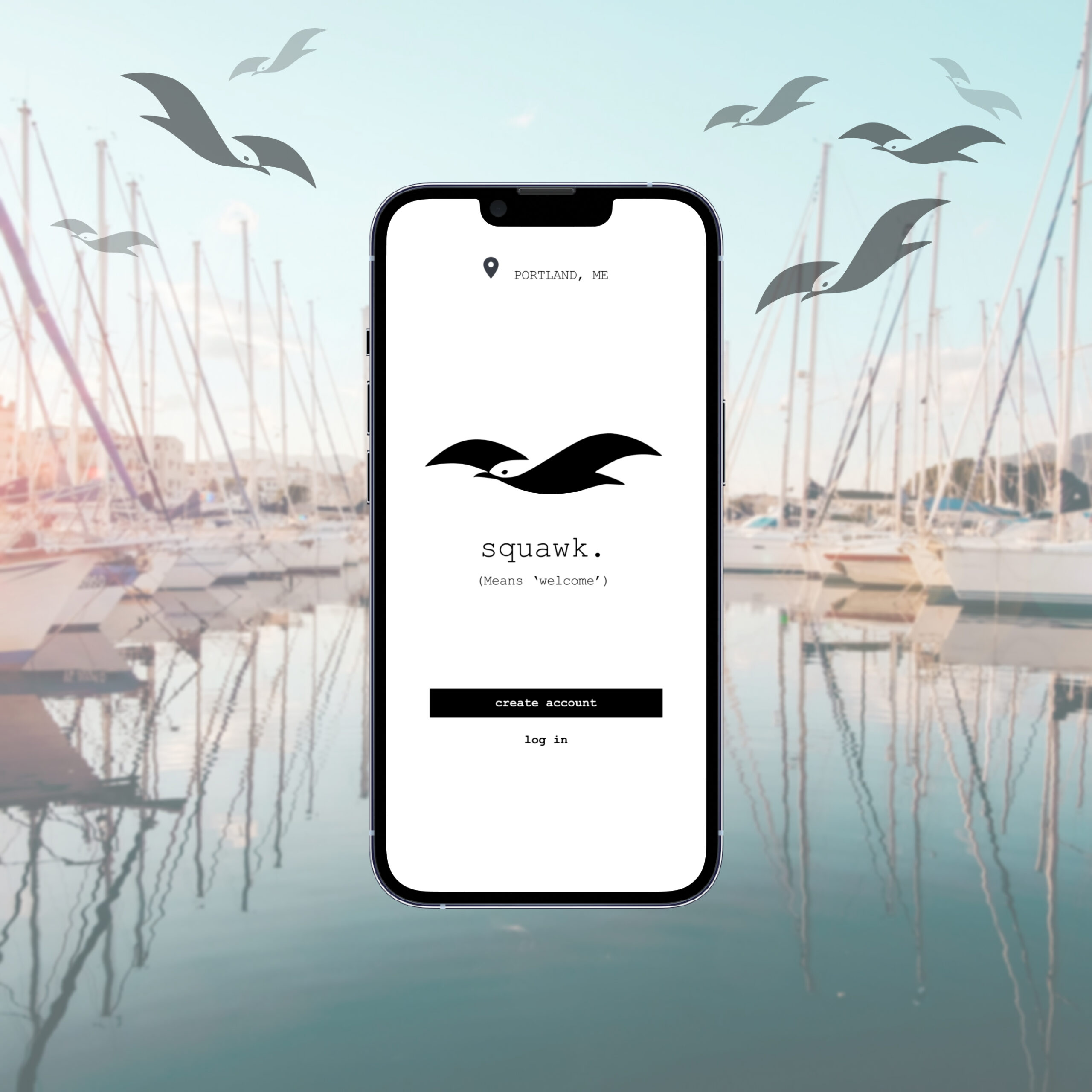
Why "collabs"?
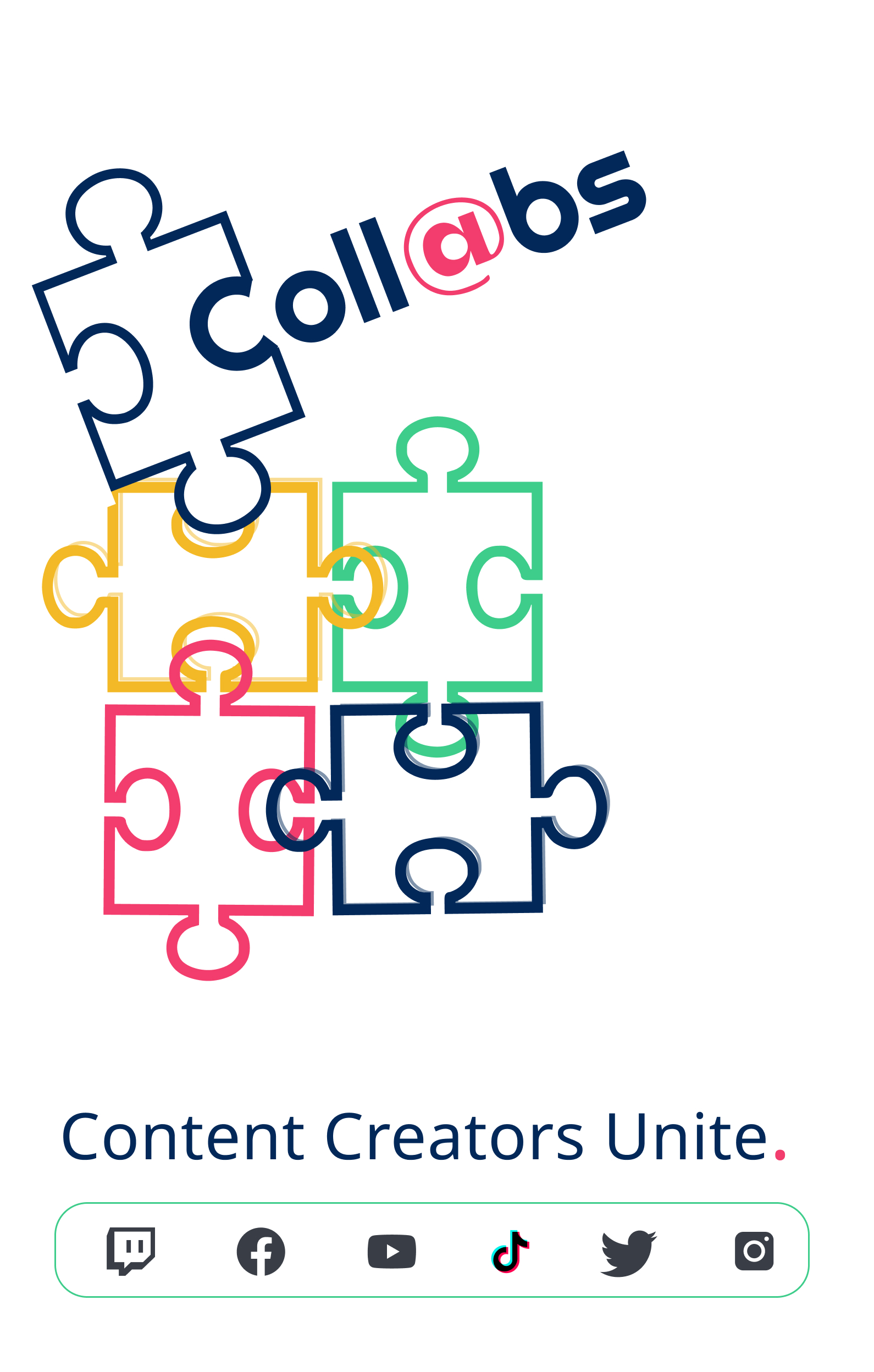
Collabs are what users call social media collaboration. It's a familiar, friendly term that provides clear information about the function of the product.
BRANDING
A unique icon set helps communicate branding.
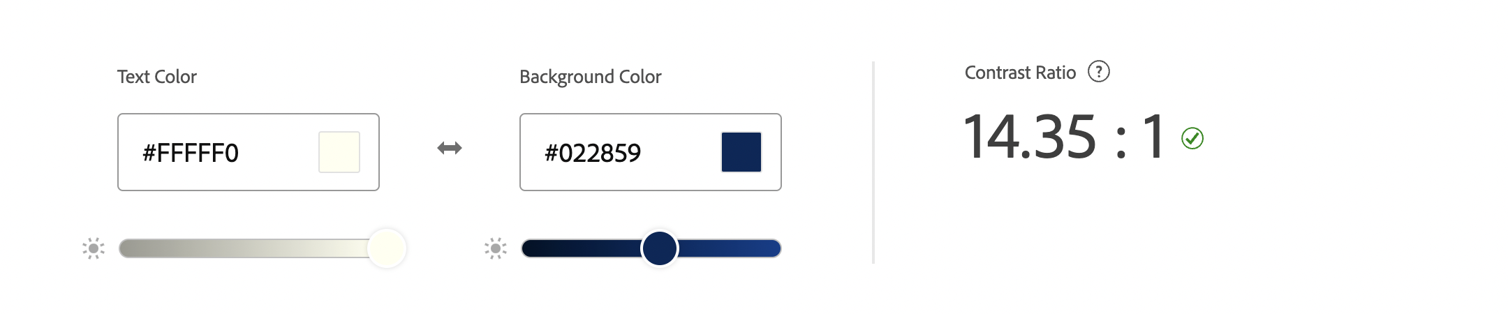
ACCESSIBILITY
I ensured that the contrast ratio and CVD safety of all colors and actionable combinations matched WCAG and HIG standards.
WORDMARK
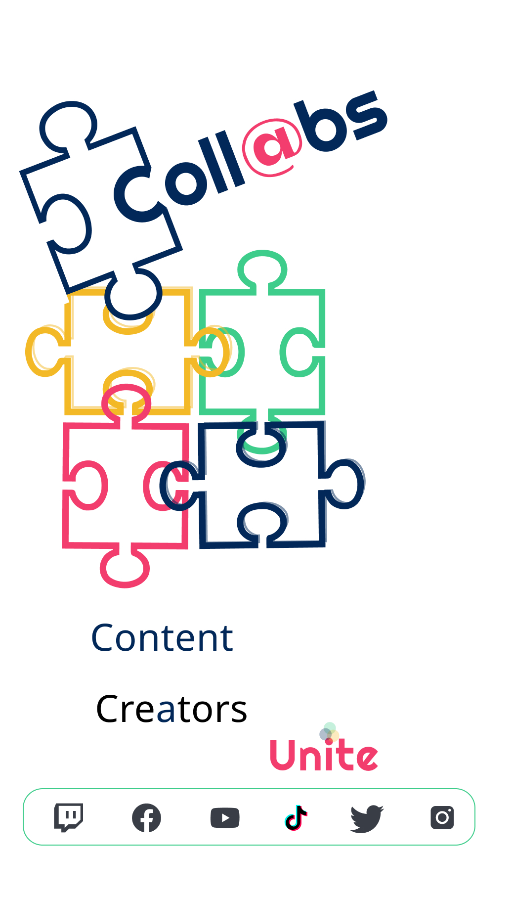
The image of a puzzle piece is a recognizable symbol of collaboration.
Puzzle pieces don't seem to mean much on their own, but they can combine to create something beautiful.
The @ symbol was integrated because this is a symbol that my app's users are very familiar with. The symbol is used to "tag" another user on social media platforms, which boosts visibility.
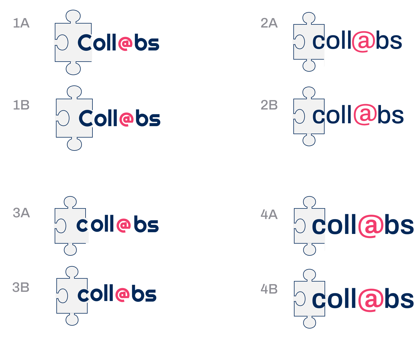
I continued to explore iterations.
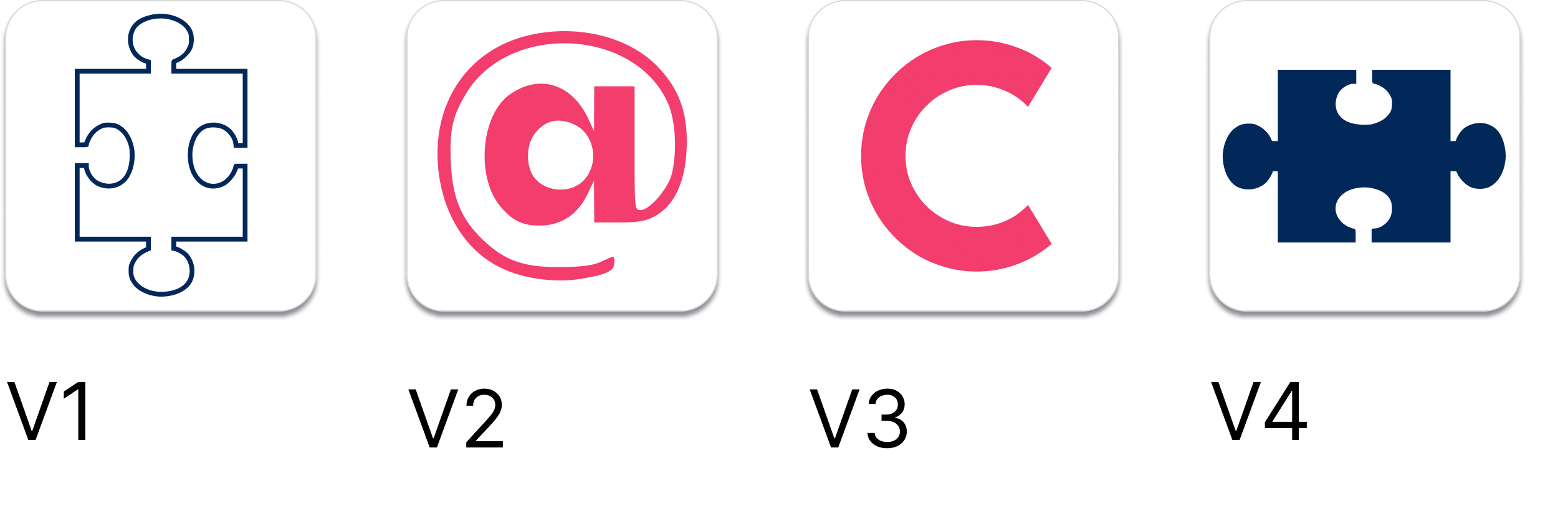
APPLICATION ICON
As per Apple's HIG, I created primary and secondary app icons.
V2 and V4 were chosen. The @ symbol is a recurring icon throughout the design, and the puzzle piece is easily recognizable as part of the logo. The filled-in puzzle piece is easier to read at small sizes.
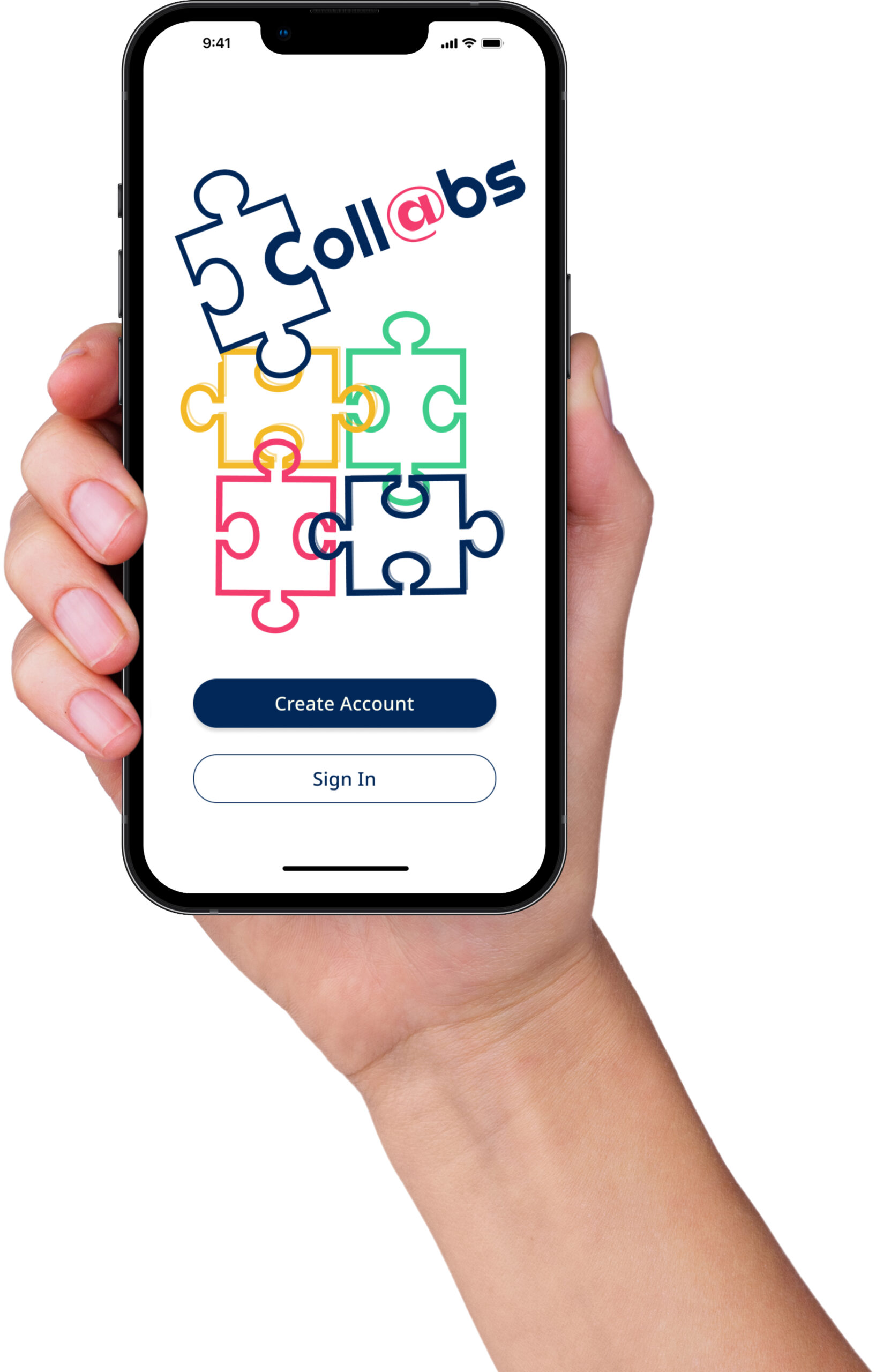
PROTOTYPE
In this interactive prototype, you can create a profile and then swipe through a few potential collaborators' profiles. Happy collabing!
KEY LEARNINGS
This project highlighted the value in iterating, and validating assumptions prior to making changes.
- Always iterate.
I'm glad that I brainstormed a broad range of ideas early on, so that when I had to go back to the drawing board, it wasn't as big of a setback. - Validate early and often, keep eyes on the data to optimize.
With limited time to research every UI choice, it was difficult to pin down reasoning behind certain choices for the MVP. It doesn't work to ask users "what's your favorite corner radius for buttons?" After shipping the product, I plan to employ a mix of qualitative and quantitative metrics to identify areas of opportunity for improvement. - Narrow down the problem.
After creating my first prototype, I realized that I had come up with a bit of a "kitchen sink" solution. Honing in on an even more specific probelm space helped me overcome this tendency. - Don't discount the power of emotional impact.
A big part of why I decided to pivot to a new product was that the users just didn't seem excited about the first solution. It could have had a technically perfect UX, with the most well-researched UI elements in the world, but if people weren't excited about using it, it would not matter.
NEXT STEPS
Content marketing; Multi-platform; Leveraging analytics and feedback.
- Launch a content-based social media marketing campaign and a marketing website, to develop critical mass prior to hard launch.
- Additional rounds of testing with my target users, to find out which features matter most to them.
- Develop an incentivized feedback mechanism for early adopters.
- Develop a system for leveraging traction and engagement metrics.
- Develop an Apple watch dashboard for the app.
- Develop an Android version.
Thank You for Reading!
Design Projects
EdTech: Accessible Icon DesignAndroid Native UX Design
Navigate Portland: Logo DesignGraphic Design
Beyond Plus for Canada GooseMobile Web UX Design
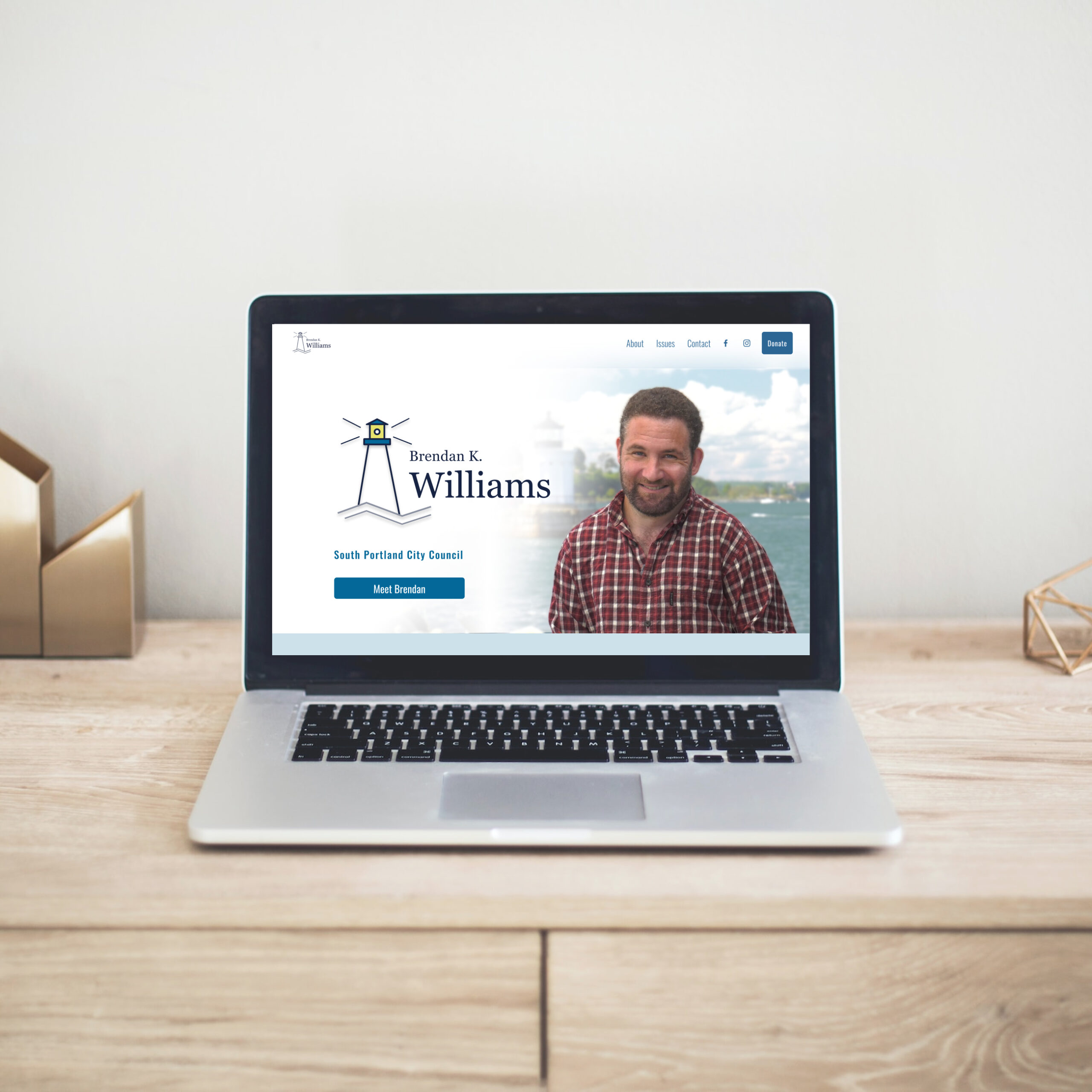
Political Candidate WebsiteWeb UX & Brand Design
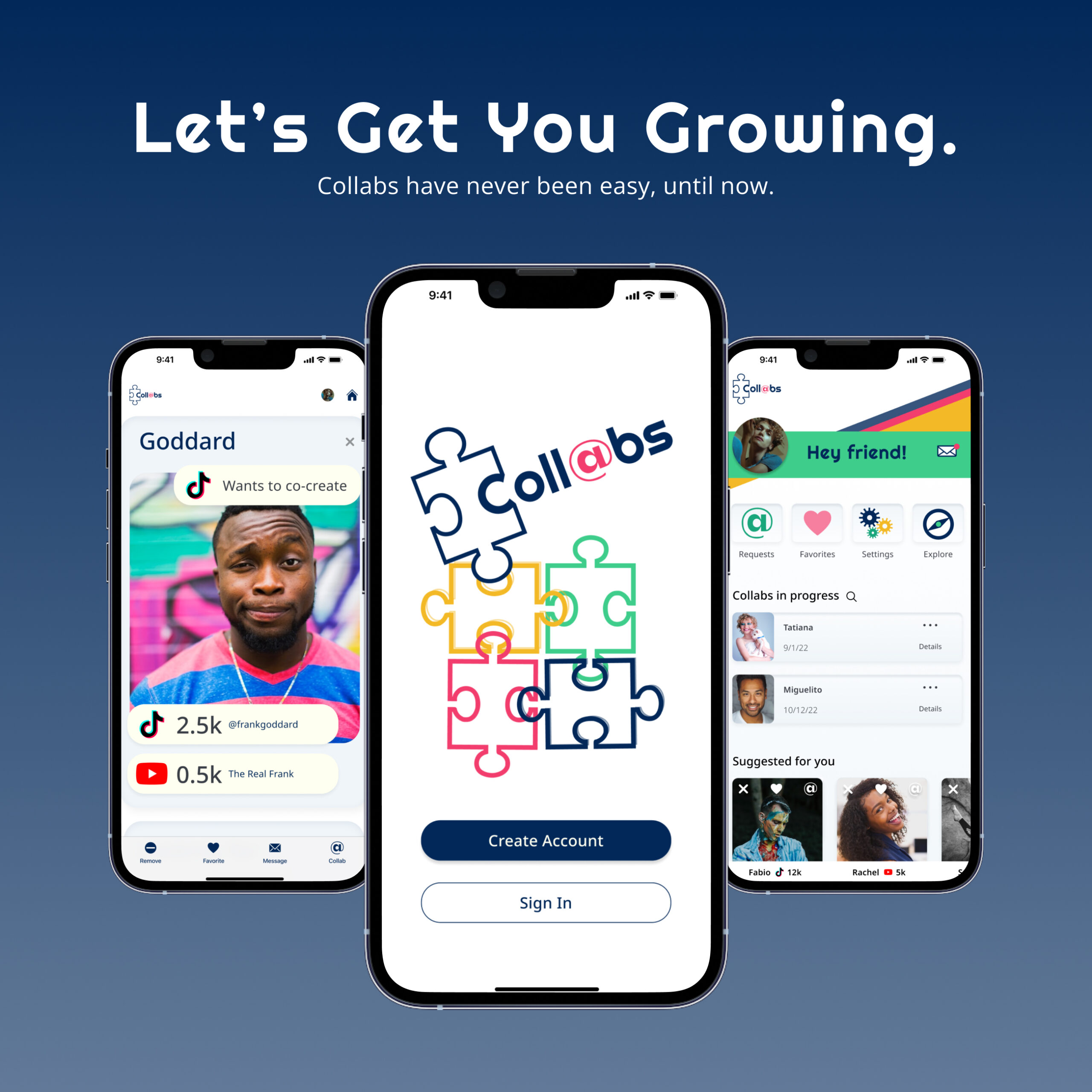
Collabs Mobile AppiOS Native UX & Brand Design
Julia Workman
Product Designer
Portland, ME, USA
workmanjulia@gmail.com
LinkedIn
© Julia Workman 2023
UX design portfolio