Political Candidate Website
by Julia Workman
Project Type: Website design & build, brand design
Client: Brendan K. Williams (politician)
Platform: Web
Year: 2022 (6 weeks)
My Roles: UX/UI designer, brand designer, website developer
Tools & Tech: Figma, Squarespace, HTML/CSS
QUESTION
How might we bring human-centered design to a political campaign website?
Brendan K. Williams, a candidate for City Council in South Portland, Maine, asked me to design and build a campaign website that would make it easy for constituents to find information about his platform, contact him, and donate to his campaign.
My final design provided easy, straightforward ways for users to accomplish their most important goals, while presenting them with opportunities to take actions that also aligned with project goals.
IMPACT
"[Julia] not only created a beautiful layout and logo, she made the site easy to navigate, and taught me about accessibilty... my campaign has exceeded funding goals."
-Brendan K. Williams
Design Goals
- Create an easy and appealing online donation experience
- Provide clear information on Brendan's political platform
- Make it easy for constituents to contact Brendan directly
- Make the site mobile-friendly and optimize for accessibility
Not satisfied with a piecemeal method of door-to-door canvassing and posting on social media to solicit donations and engage constituents, Brendan wanted a central hub for all of this: a campiagn website.
I generated this list based on Brendan's campaign goals:
- Raise $8k in campaign funds by election day
- Get a high enough percentage of the vote to secure a seat on the South Portland City Council
Constraints
- Technical constraints of the Squarespace CMS
- Partial visual style guide and assets provided by campaign
- Time: website must be launched 2 months prior to election day
RESEARCH: PHASE 1
I conducted an analysis of the websites of winning politicians.
I chose this method based on resource constraints. I looked at the websites of five politicans with similar platforms as Brendan, who had won an election at the state or federal level in the past 4 years. I made the assumption that politicians who have won elections at this level have digital strategists or reputable design agencies with whom they work. These professionals are likely to have access to pertinent data on user behavior that I do not have.
I visited all of the websites on desktop and mobile viewports. I cataloged the following attributes of each site:
1) Hard CTAs
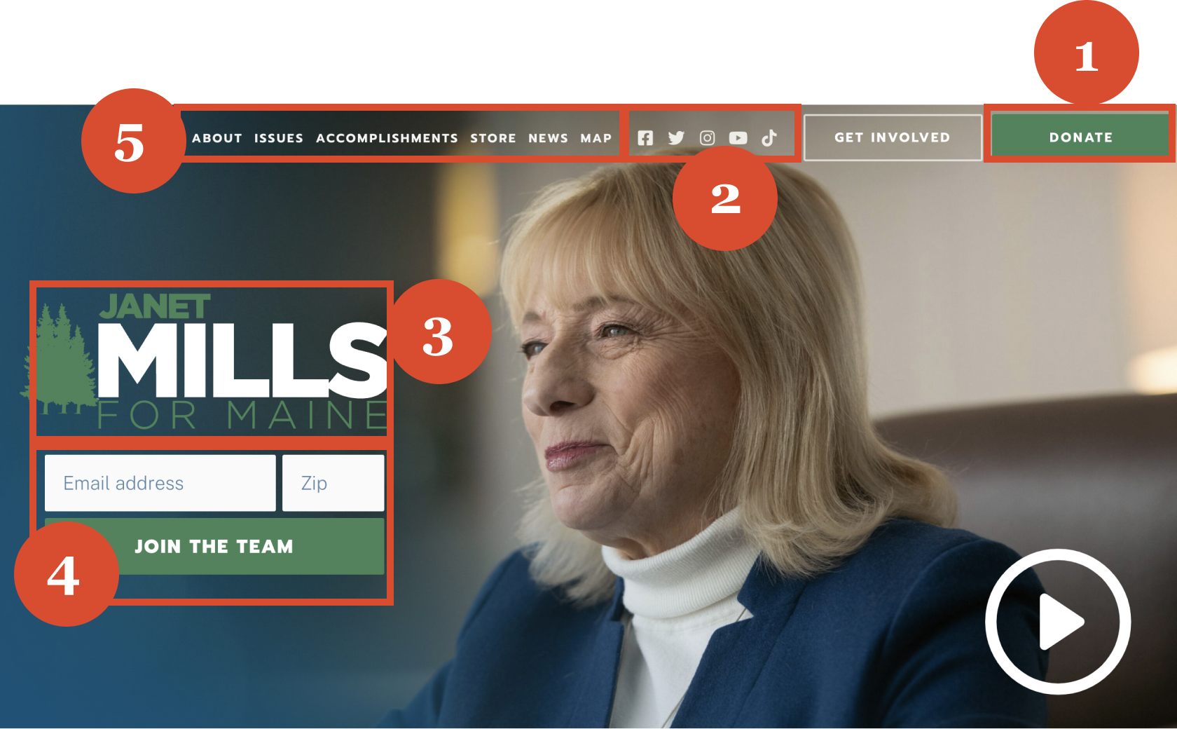
100% of websites included buttons with "donate" CTA in contrasting color combinations. They always appeared in multiple locations on the site, and the locations differed, but universally, a donate button appeared in the top right corner at the laptop breakpoint (1366x768).
2) Social Icons & Contact Info
100% of sites included social icons on the homepage in a conspicuous location, as well as in the universal footer. Some sites had the politician's phone number and email address bannered across the top of the page; others included this information in the footer.
3) Campaign Logo
Logos featured the politician's last name or full name in enlarged letters. In terms of imagery, the symbols evoked an association with the geographic identity. Examples included pine trees for a Maine state politician; a red-white-and-blue palette, and/or stars and stripes, for federal politicians.
4) Forms
Forms appeared for multiple use cases throughout the sites. They were used to encourage direct contact to the politician, as well as for collecting contact information from users, and payment platform integration for donations.
5) Information Architecture
All main site paths were accessible from the home page in the form of CTAs, and from global navigation components on other pages.
RESEARCH: PHASE 2
To optimize the donation process, I conducted interviews with web users who had a history of making online donations.
I recruited participants through my social and professional networks (Facebook, Slack and LinkedIn). I chose to focus this portion of my research on the donation task flow. This was the function with which I had the least amount of prior experience designing, and it was one of the site's most critical functions.
User Must-Haves
- Chance to learn more about the recipient(s) of the donation.
- Quick and straightforward dontation process.
- Do not want to feel pressured or guilted into donating.
User Nice-to-Haves
- Assurance that the donation is secure.
- The opportunity to contact someone with questions about the organization.
- A variety of convenient payment options, such as PayPal
or Apple Pay. - Information about what is being purchased with donations.
Visual aid used in interviews with users about expectations and preferences regarding the website experience.

DATA-DRIVEN DESIGN
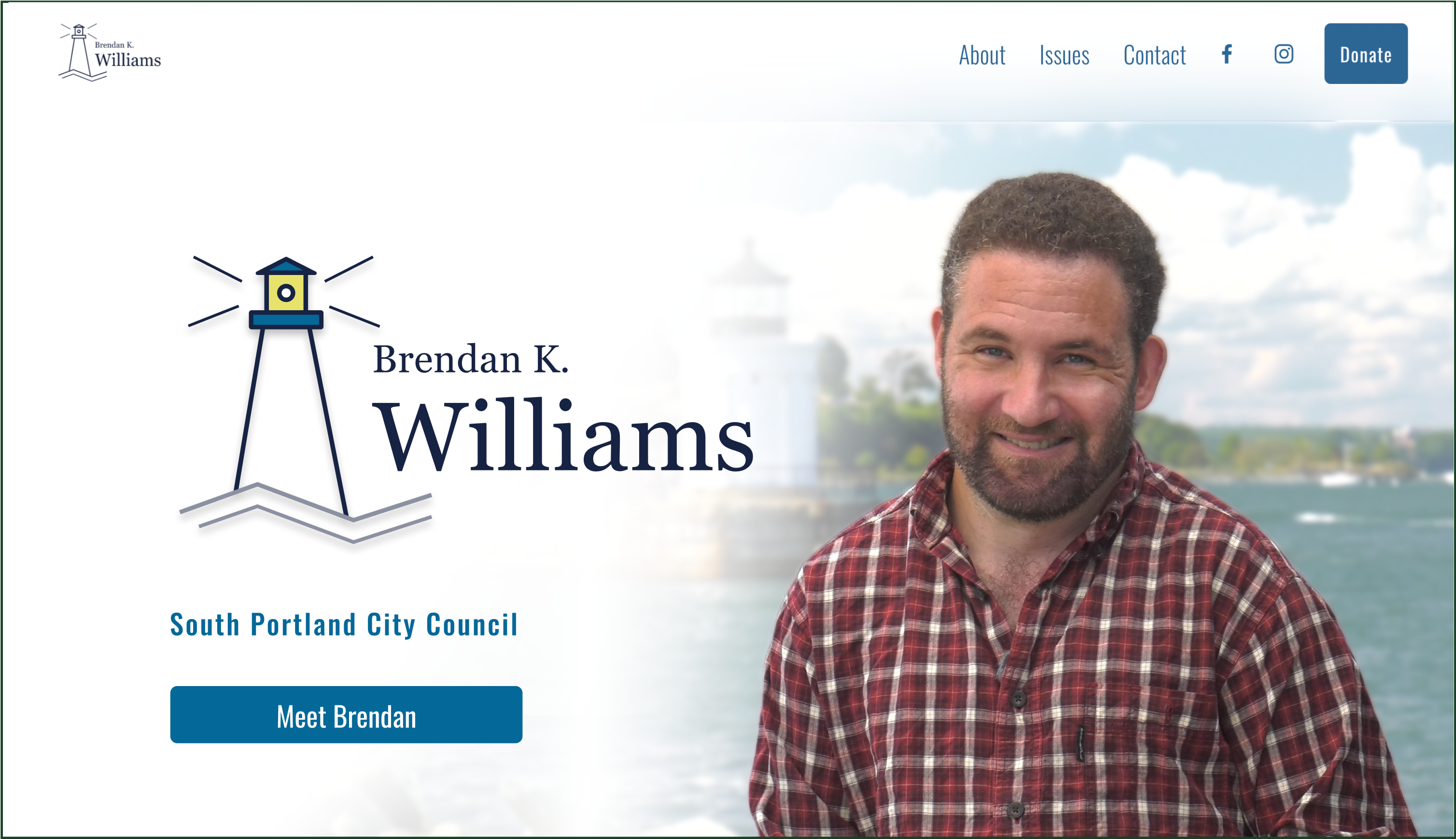
The UI featured intuitive pathways for users to accomplish their goals and access information.
1) Primary CTA
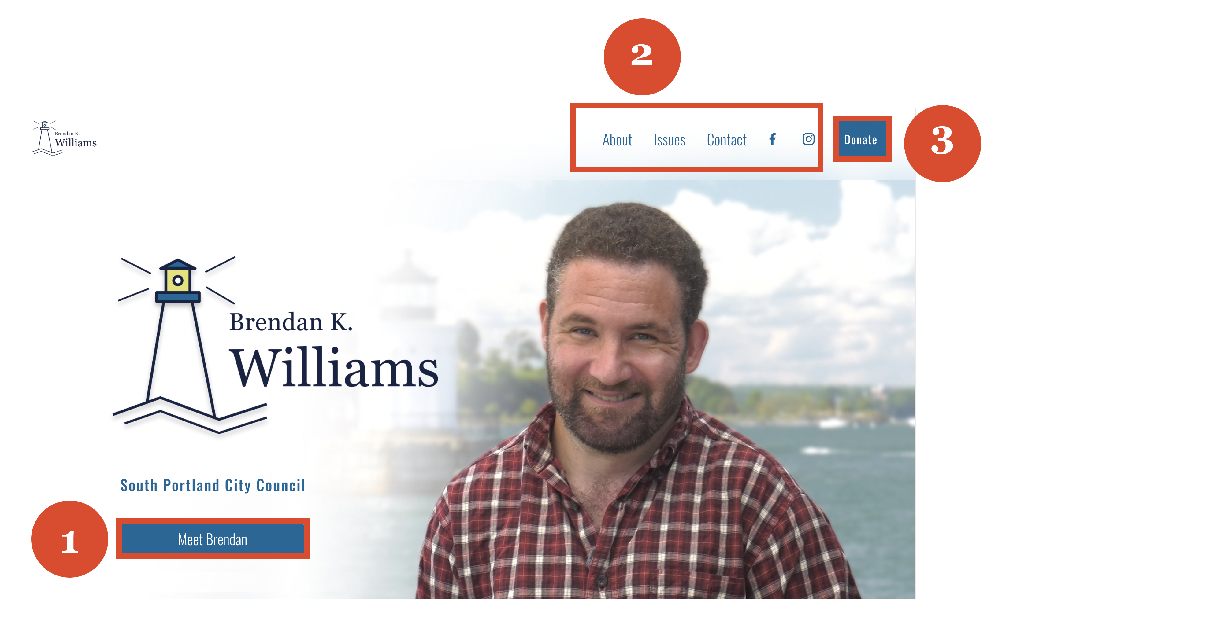
Many users who land here will have a primary goal of learning more about Brendan as a candidate. A friendly and neighborly tone-of-voice was chosen for the microcopy, because Brendan wanted to come across as approachable to his constituents.
2) Navigation
In Phase 1 of my research, I found that politicians typically invite website visitors to visit their social media accounts. I linked to Brendan's approved socials on the top navigation element and in the global footer.
I also found that the pages linked in the top navigation were woven together not only by global elements, but by hard and soft CTA's within the page content as well. For the global navigation copy, I used terms universally found on the websites of the other politicians I studied: About, Issues, and Contact.
3) Secondary CTA
Users who land on this page will sometimes have the goal of making a donation to Brendan's campaign, and we definitely wanted to encourage that.
However, making "Donate" the primary CTA could run the risk of violating users' trust. The political websites I studied in my research all had donate buttons on the header, but they had different CTAs in the hero section.
Art Direction
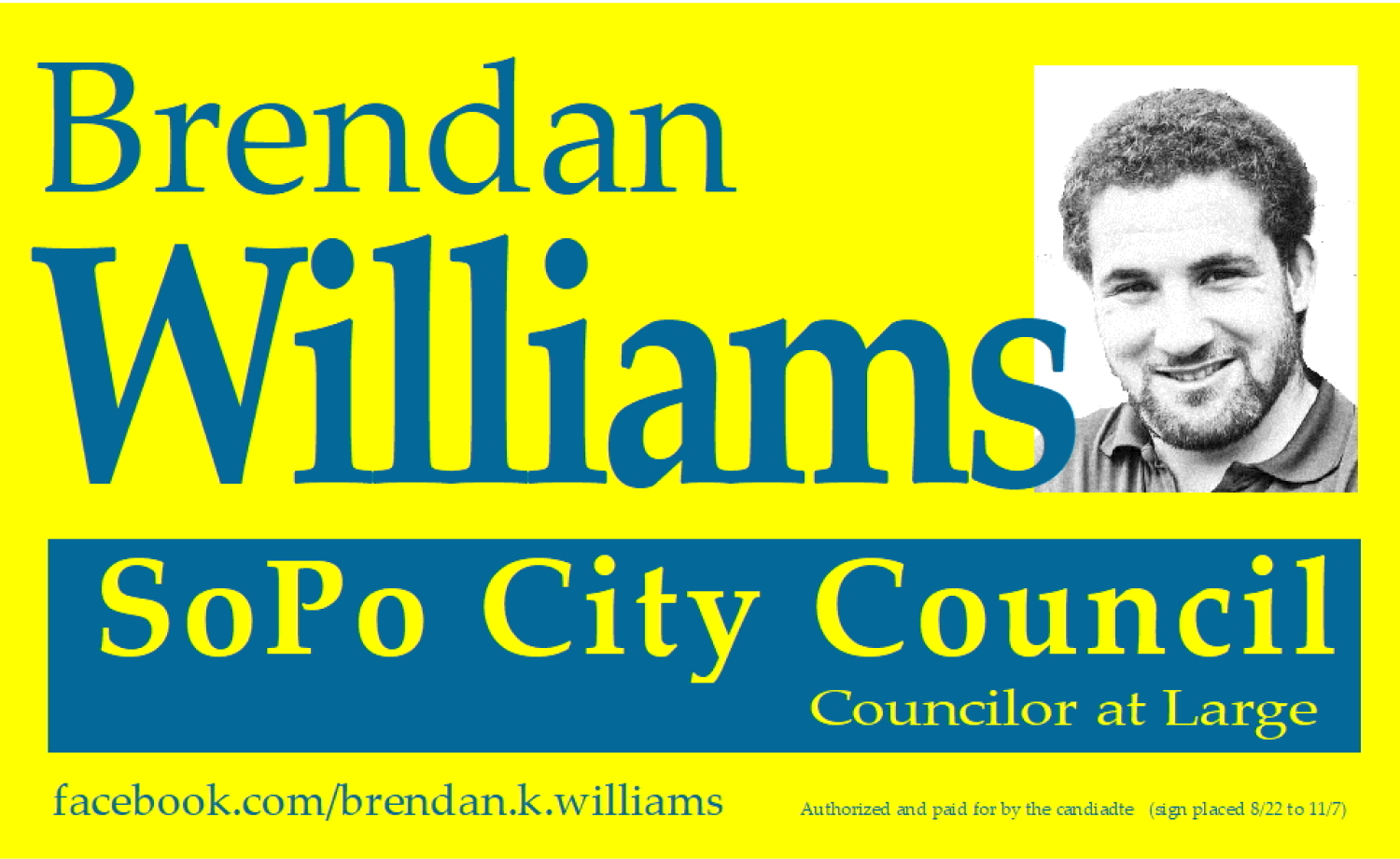
Before
-Mismatched colors
-Low resolution photography
-No unique logo
-No connection to place
After
-Complementary colors
-High resolution photography
-Unique logo
-Connection to city's maritime history
VISUAL STYLING
Brendan had been using these visual assets on campaign materials:
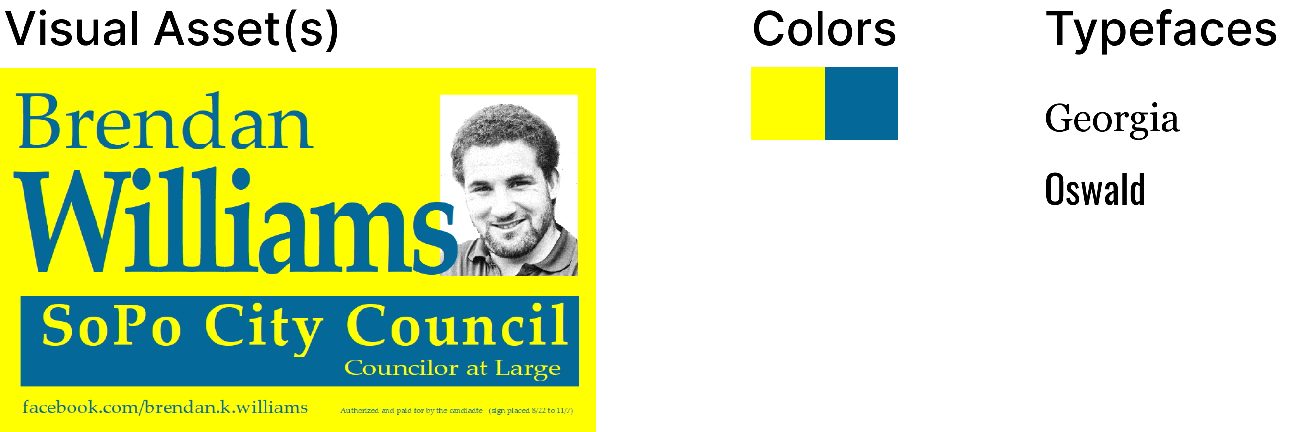
Brendan didn't have a lot of strong opinions on design, but he knew that he wanted his campaign colors to be blue and yellow.
PROPOSED CHANGES
"It's a little hard on the eyes."
-Starbucks Patron
When I asked a few casual observers at a coffee shop (guerilla research!) what they thought of the blue and yellow banner, I received similar feedback: the design did not appear visually harmonious.
One likely reason that my poll participants felt that the design was "hard on the eyes" is because of the color scheme. It appears as though the designer of the image was aiming for complementary colors.
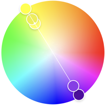
As you can see on the color wheel, the true complement to the bright shade of yellow in Brendan's design would be a dark or muted purple, not blue.
INSPIRATION
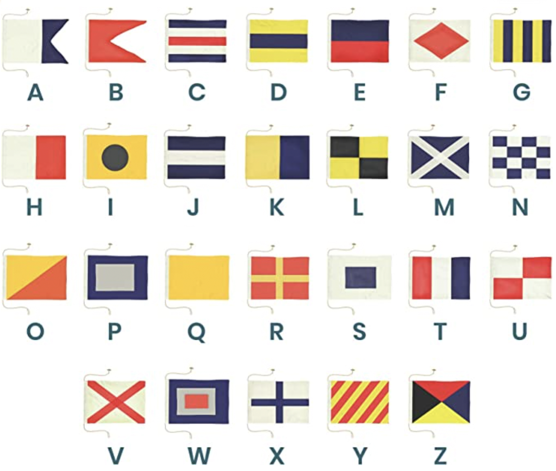
Maritime signal flags inspired an updated visual identity.
Brendan wanted to keep the blue and yellow color scheme, but I had to come up with hues that were easier on the eyes. I sought inspiration in this nautical alphabet; patterened flags that historically were used to communicate with ships.
The reference was culturally relevant, since the city of South Portland, Maine, is on the ocean and has a rich maritime history.
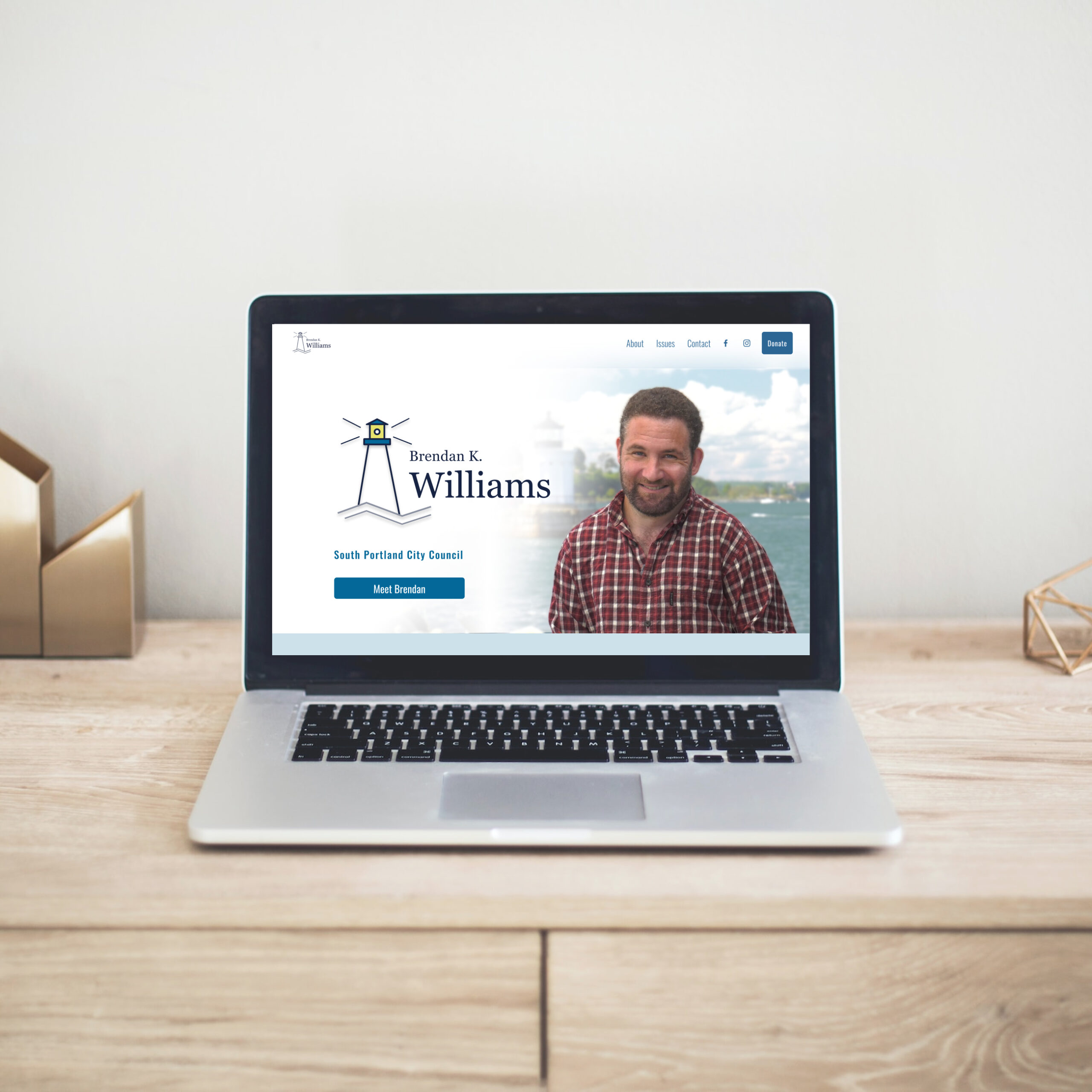
NEW COLOR PALETTE
Colors from the maritime signal flags evoked connection to the sea.
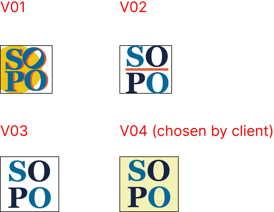
CAMPAIGN LOGO
I proposed a logo depicting the city's most iconic feature.
The city of South Portland is known for a lighthouse called Bug Light. The lighthouse logo would help voters associate Brendan's campaign with the city.
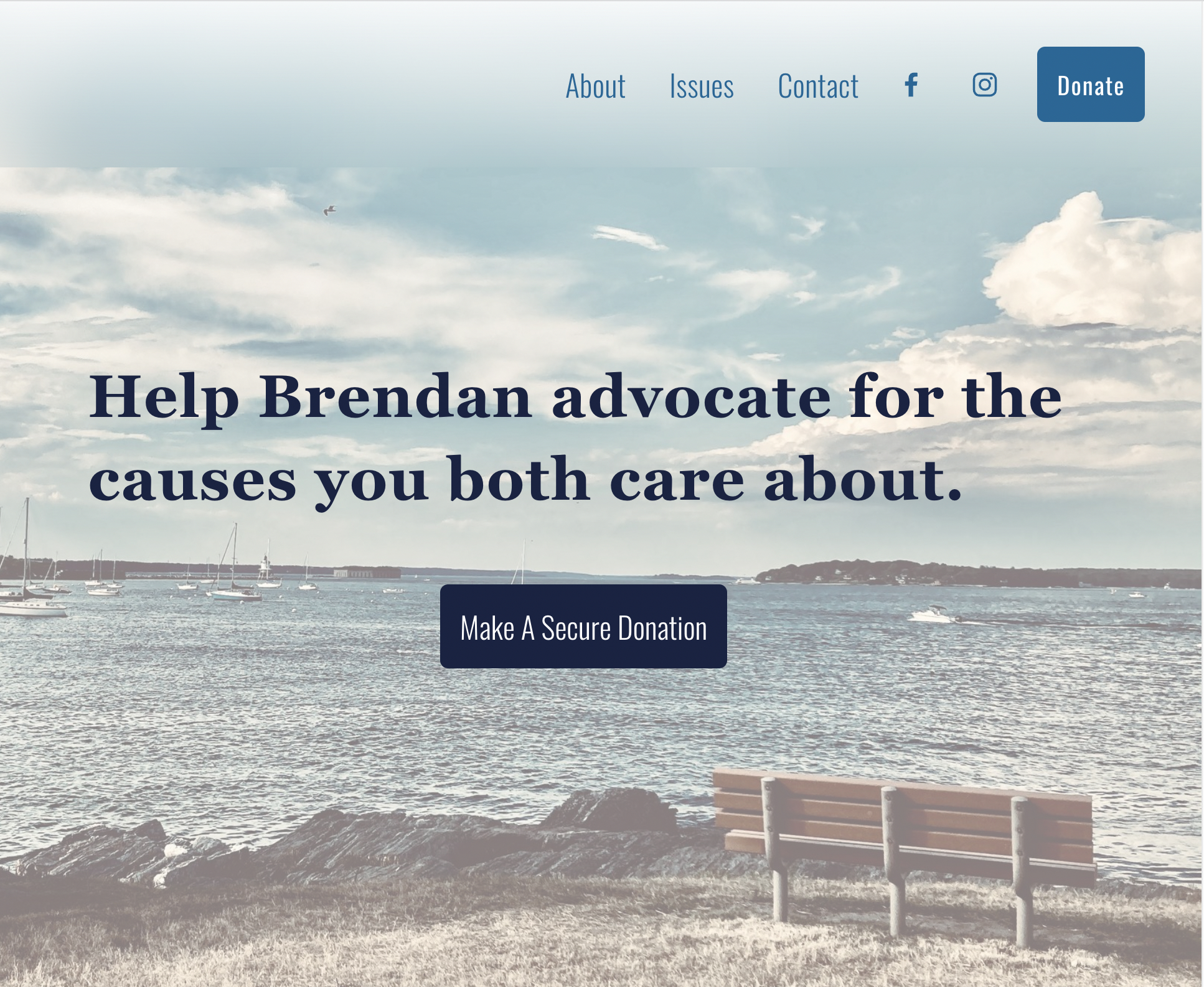
HOME PAGE DESIGN
I iterated on designs for the site's hero section.
FAVICON
For the browser icon, I used the moniker "SoPo," an abbreviation of "South Portland" which is familiar to residents.
ACCESSIBILITY
As a self-proclaimed disability rights advocate, I encouraged Brendan to take digital accessibility into account.
Distinguishability
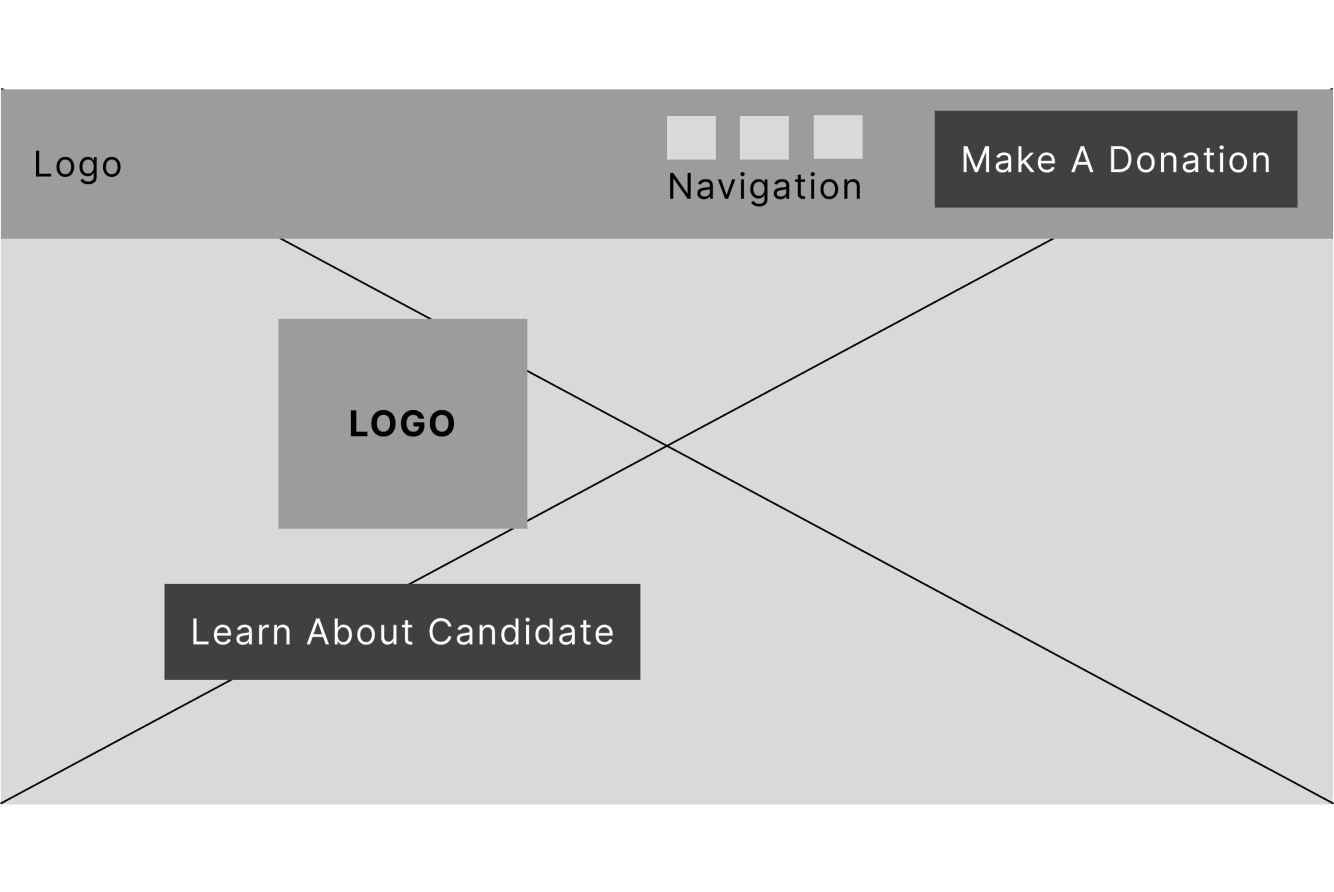
The client wanted a hero image content layout. It was necessary to overlay copy and UI elements on top of the image. This can pose challenges to visual clarity and legibility, especially for responsive designs.
Solution
Blurring the image background, as well as adding a white linear gradient behind the logo and text, allowed for greater distinguishability between the words and image.
Audiovisual Content
The client had a video with audio content that they wanted to include on the landing page, which can present challenges for those who are not in a physical state or environment conducive to hearing.
Solution
I used a web-based tool called Amara to add closed catptioning to the video.
Color Contrast
The text and background colors on a given page are most visually accessible when they conform to the WCAG guidelines for contrast.
Solution
I used Adobe accessibility tools to ensure that all text and background color combinations were WCAG compliant, and were colorblind-safe.
TECHNICAL CONSTRAINTS
At the time of development, Squarespace did not support API integrations in the site header.
Squarespace facilitated integration of payment services such as Stripe, which are accessible through various "content blocks" in the website builder toolkit. In order to allow users to donate money, a "donation block" had to be added to the page, which would display on the front-end as a button, and on the back-end linked to the Stripe plugin.
As per my research findings, a donate button on the website header at the laptop breakpoint was necessary. However, editing the global header element did not provide the option to add a donation block to it. I had to use a non-integrated button on the header, and link it to an additional page on the site where I could integrate the donation block.
This was not ideal; it went against the user-centered principle of making the donation process as simple as possible.
However, I took this opportunity to addess one of my users' "nice-to-haves"- assurance that their donation is secure. The button copy reads "Make A Secure Donation."
Thank You For Reading!
Design Projects
EdTech: Accessible Icon DesignAndroid Native UX Design
Navigate Portland: Logo DesignGraphic Design
Beyond Plus for Canada GooseMobile Web UX Design
Political Candidate WebsiteWeb UX & Brand Design
Collabs Mobile AppiOS Native UX & Brand Design
Julia Workman
Product Designer
Portland, ME, USA
workmanjulia@gmail.com
LinkedIn
© Julia Workman 2023
UX design portfolio