Accessible
Icon Design
by Julia Workman
Project Type: UI component-based system design
Client: EdTech startup (NDA)
Platform: Android
Year: 2022
My Roles: UX Designer & Researcher
Team: 1 Product Manager, 3 React Developers
Tools: Figma
QUESTION
How might we optimize navigation icons for accessibility on mobile?
The Product Manager at a startup in the EdTech space approached me with a problem:
The navigation icons in one product were hindering usability.
One of their biggest clients, a university, was submitting a large number of support requests for a particular product.
Through his own research, including talking with users and heat map analysis, the PdM had concluded that the icon symbols did not adequately represent their functionality, and also presented challenges to users with visual impairments.
The re-design of the navigation icons was part of a larger UI design system project.
I've always been curious about how the icons we choose impact the digital experience.
For this case study, I've chosen to focus on the re-design of navigation icons, because this part of the project presented the most interesting challenge to me.
BACKGROUND
Android native mobile application for college students.
*Note: the name of the product and other potentially identifying details have been omitted.
The app was launched by a small EdTech startup in 2019. With no in-house design team, the PdM, whose background was in economics, was handling UX.
One of the most important design requirements for their portfolio of products was accessibility. Accessibility of education technology in the United States is mandated by Section 508 of the ADA, and non-compliance could have legal ramifications.
Through the PdM's investigation of lower-than-optimal adoption and retention rates, he had concluded that certain elements within the UI needed to be updated to fit the product's unique needs.
An icon of a stack of books, which was supposed to mean "work," was interpreted to mean "school" by the users, who were university students.
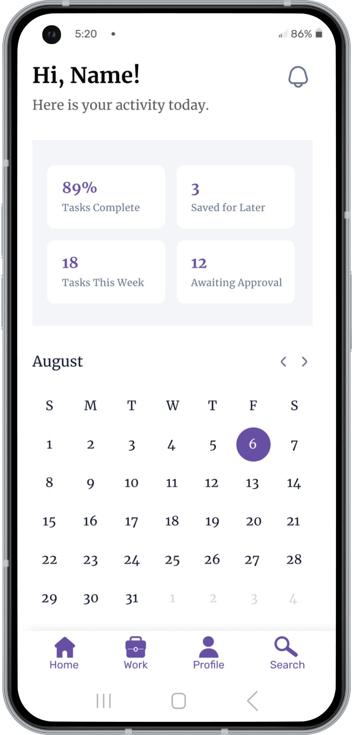
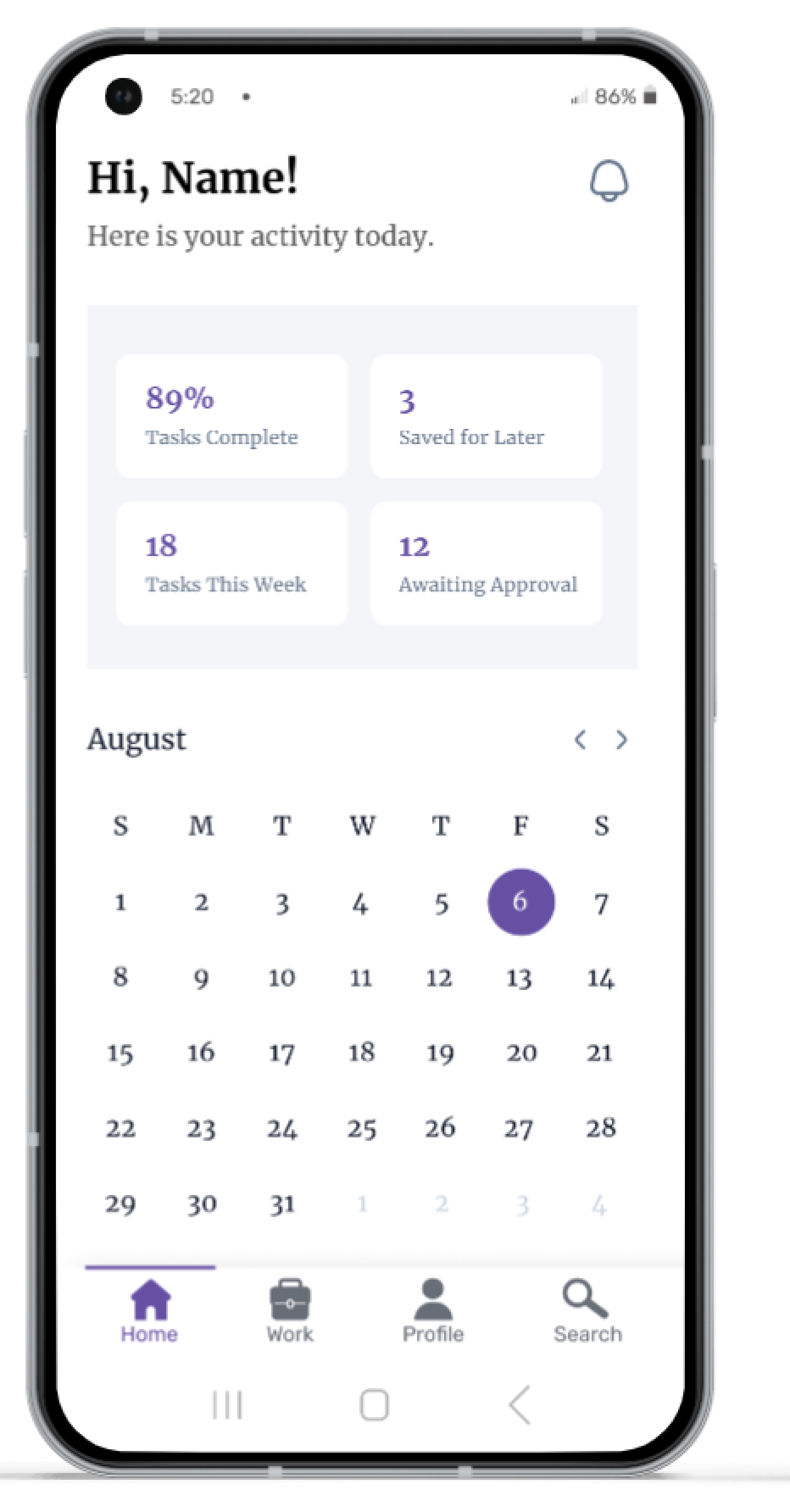
UI before navigation icons were optimized for accessibility.
Business Goals
Achieve adoption rate of 25%, and retention rate of 30%. Proactively avoid legal issues.
Design Goals
Maximize accessibility of navigation icons to prevent errors and optimize usability.
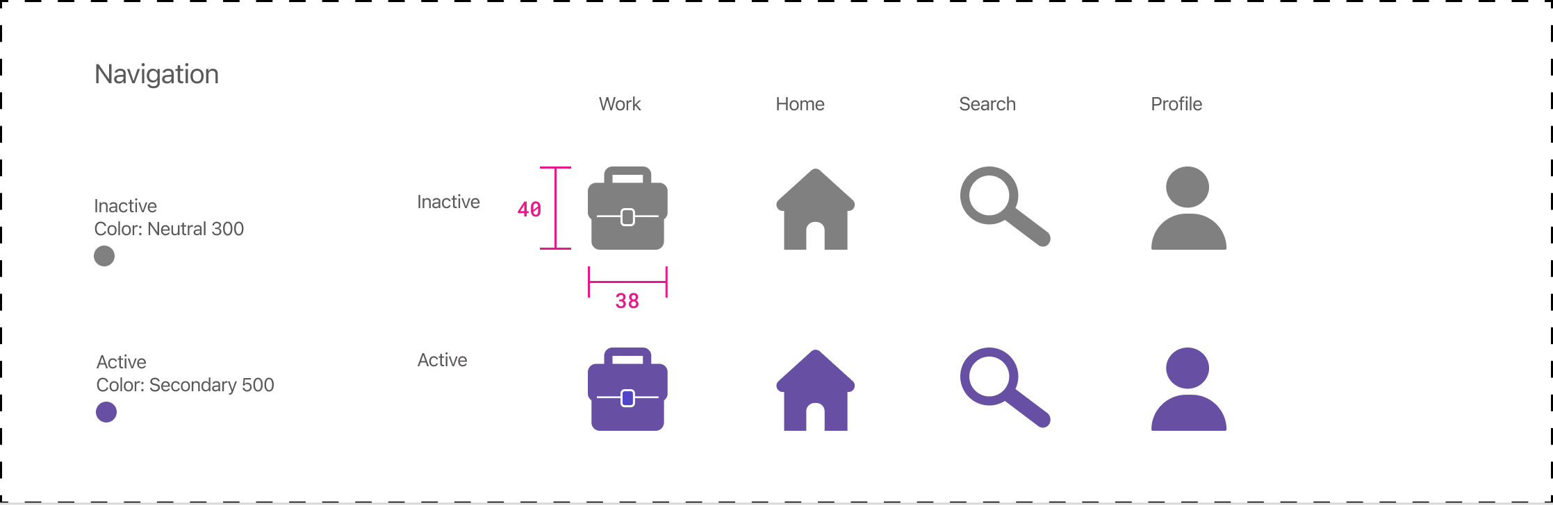
BEFORE AND AFTER
Navigation icons were re-designed to maximize accessibility.
Before: Navigation icons of original UI
- 1 px outlines and lots of detail compromise accessibility
- Paper behind the magnifying glass is not standard, and compromises recognizability of that symbol
- Stack of books is seen as representing academic study, which was not the intended meaning
- Black active state looks to similar to dark grey inactive state

After: Icons optimized for accessibility
- Minimum 4 px outlines are easier to read at small sizes
- Magnifying glass alone is more standard for "search"
- Briefcase is associated with "work" by users moreso than the stack of books
- Accessible color from Material UI creates greater distinction between active and inactive icons
BUSINESS IMPACT
We estimated that design changes would help boost adoption and retention by 15-20%, and help avoid legal trouble.
These estimates were based on our research around the impact of UI usability issues, and the Product Manager's experience with making similar changes to products in the past.
RESEARCH METHODS
Methods were chosen to align with project requirements and resource constraints.
Consult WCAG, WWWC, Material UI and Apple HIG
Specifically their documentation on accessibility. I identified the criteria which represented an intersection of all of their requirements. This was important, because the PdM wanted a set of icons that could be used cross-platform in the future.
Conduct Usability Tests on Icons
After thoroughly researching documented requirements for accessible icons, I planned to use the Nielsen Norman Group's guide to usability testing of icons, and recruit participants from my immediate environment (friends and family). While this guerilla recruitment method was not ideal, in this case it wasn't logistically feasible to test with the target group.
7 Participants:
- Between the ages of 16-40
- 3 voluntarily identified as visually impaired
- Experienced using mobile apps
WCAG & WWWC
Icon symbols should be "familiar and simple."
WWWC's Web Accessiblity Initiatve says that icon imagery should be "familiar and simple." Naturally, we know that what is familiar or simple to one demographic may not be to another.
WCAG says to use "standard icons" and avoid using icons with multiple meanings. Standard icons would be considered those that are commonly used and recognized by users, such as a magnifying glass to mean "search."
"What matters in the end is not only whether users can recognize what real object the icon resembles, but also if they can infer what functionality that icon may stand for.
In fact, as long as people understand what function a symbol represents, it doesn’t matter if they don’t know what the object is."
-Nielsen Norman Group
Are these symbols familiar to you?
COMPARE & CONTRAST
I documented similarities and differences between HIG and Material UI accessibility guides.
Overall, both Material UI and Apple's HIG provide similar guidance on designing for accessibility, but there are some differences in the specifics of their recommendations.
Similarities
- Color contrast: both recommend using sufficient contrast between text and background to ensure readability for users with low vision.
- Line weight & complexity: both guides recommend using a line weight of at least 2 (dp, or pts depending on the guide), in order to ensure readability. Both also caution against the use of excessive detail.
- Text labeling & language: both suggest using text-labeled icons with clear and concise language, and avoiding jargon or complex words that may be difficult for some users to understand.
- Alternative text: both recommend providing alternative text for images, so that users with visual impairments can understand the content of the images through screen readers or other assistive technology.
- Touch targets: For mobile-only designs, both specify 44x44 px as the minimum touch target size.
Differences
- Aria-label attributes: Material UI emphasizes the use of aria labels, normally applied during development, to provide additional information to assistive technologies, whereas Apple's HIG does not mention this specifically.
- Dynamic type: Apple's HIG recommends providing adjustable text size and dynamic type, while Material UI does not mention this specifically.
- Use of color: Material UI emphasizes the use of color as a means of conveying information, while Apple's HIG recommends avoiding using color alone to convey meaning.
- VoiceOver: Apple's HIG provides specific guidance on designing for Apple's own screen reader technology, while Material UI does not mention specific screen reader technologies.
Sometimes, due to their shapes, icons need to be set to different dimensions in order to appear optically balanced. Neverthelss, the total touch target, which includes the area around the icon, will still be 44x44 px.
Design Decisions
Documentation analysis and prioritization from usability test results produced the designs most likely to meet the needs of users.
COLOR
A Material UI color, medium purple, is accessible and communicates branding.
To best accommodate users with color vision deficiency (CVD), I avoided the colors red and green. That's because red-green colorblindness is the most common type of CVD. Blue-yellow CVD exists as well, but it is much less common.
Seeimingly, if I wanted to ensure that the color of the icons would always appear the same to all users, I should make them black, right?
Actually, it turns out that the previous icons- which had a black active state and a dark grey inactive state- were not meeting the requirements of the product. This was because the black and dark grey did not appear distinct enough. Lightening the shade of grey could potentially compromise accessibility because it may not have an optimal contrast with white.
Although I could have chosen to tweak the shade of grey to the perfect in-between, another consideration was the branding and style guide of the product. The product was plain with very little color. I chose to add the purple shade from Material UI because it served two purposes:
- Increased differentiation between active and inactive states
- Cultivated a recognizable visual brand style for the product
COMPLEXITY
Outlines were set at a minimum of 4 dp/pt/px; inner lines at 2.
Sources of documentation on accessibility recommend keeping line weight minimum to 2-3 px.
I wasn't sure how much the pixel width would shrink as the icons scaled down to the smallest available mobile screens, so I made all outlines a minimum of 4 px to be safe. Inner lines, or details, were only an issue for the briefcase icon. I had originally set them at 2-3 px, but during testing, I found out that 1 px line worked best at scale.
The reason I added the detail lines to this shape was an effort to make it recognizable as a briefcase.
USABILITY TESTING
3 out of 4 icons were identified correctly; the "work" icon needed a slight re-design
I omitted the text labels for my icon tests.
When tested at the size that they would appear on screen, (44x44 px including negative space), some users could not tell what the briefcase icon was supposed to mean. One said, "I think it's a lunchbox- is that where I find out when my lunch break is?"
When I made the handle slightly thinner and the middle buckle slightly larger, they then correctly identified it as a briefcase, and correctly guessed that it meant "work."
The addition of a 1 px detail on the briefcase icon went against accessibility recommendations, but in this case, my decision to make an exception was informed by the test results.
Work icon before testing
Work icon after testing (thinner handle, thinner and larger buckle)
TECHNICAL CONSIDERATIONS
Icons were customized with an eye toward future cross-platform applications.
React and Android both use Material Design guidelines, and they generally have an extensively documented design system which includes componentized icons.
Luckily, React can also support custom icons. This approach was chosen in order to maintain a design system that fit the product's use cases and could also be adapted to iOS when the time came for a cross-platform product.
- Android (Material Design) guidelines recommend using flat, two-dimensional design.
- React framework requires the use of vector graphics to render custom navigation icon components. Vector graphics (SVGs) are resolution-independent and can be scaled without losing quality. This is important for icons, as they may need to be displayed at different sizes on different devices.
- QA: Testing was conducted on a few different sized devices to ensure that the icons were easy to recognize on different screen sizes and resolutions. This was immensely helpful in tweaking issues with legibility, especially with the line weight on the briefcase.
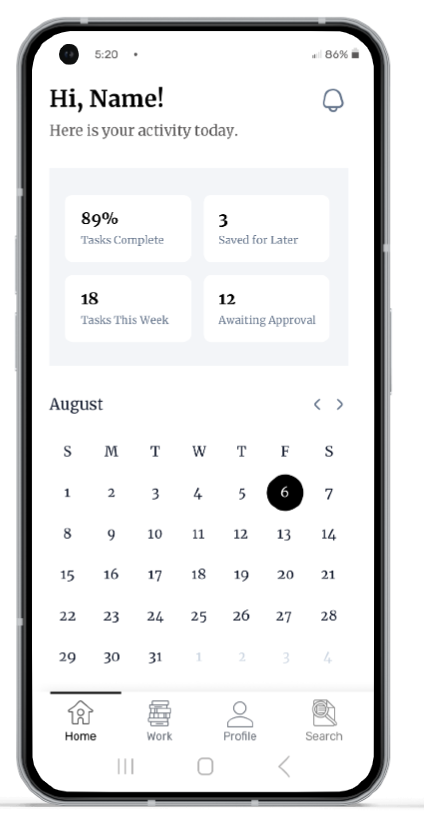
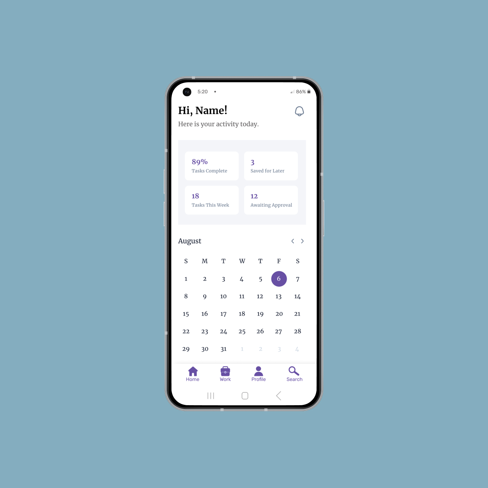
UI after navigation icons were optimized for accessibility.
KEY LEARNINGS
Consider the context; address accessibility proactively.
It was interesting to note that for a non-user of this product, the stack of books appeared to be a sound choice for the "work" section of a platform that was designed to help students organize work-study arrangements. Since the name of the activity includes the word "study," aren't books a natural choice?
Because the users of the app are university students, a stack of books is a symbol that they associate closely with their academic classes. Work-study arrangements sometimes take place in environments associated with books, such as a library or a bookstore, but sometimes they don't. Some work-study takes place in a science lab, at the gym, or another the campus medical center. It's essential to learn about users' mental models of the activity they are undertaking, so that symbols users associate with those activities can be matched in the interface.
Additionally, the research I did for this project was eye-opening in terms of building accessibility into components from the ground up.
In the future, I belive the best approach would be to address accessibility proactively in a design system, to avoid falling into a reactionary pattern of re-design.
By proactively addressing accessibility, we can achieve the most efficient workflow for our design system.
Thank You For Reading!
Design Projects
EdTech: Accessible Icon DesignAndroid Native UX Design
Navigate Portland: Logo DesignGraphic Design
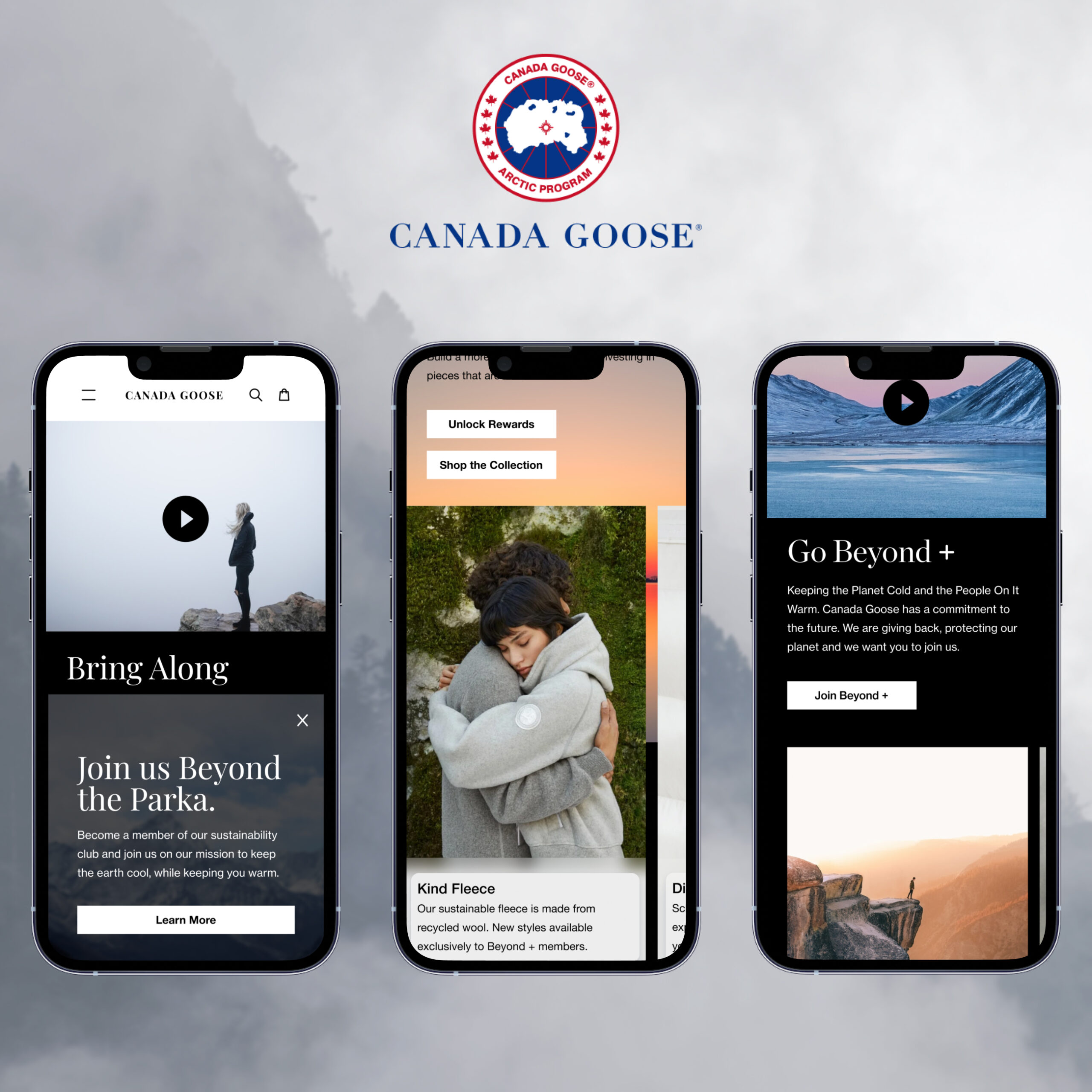
Beyond Plus for Canada GooseMobile Web UX Design
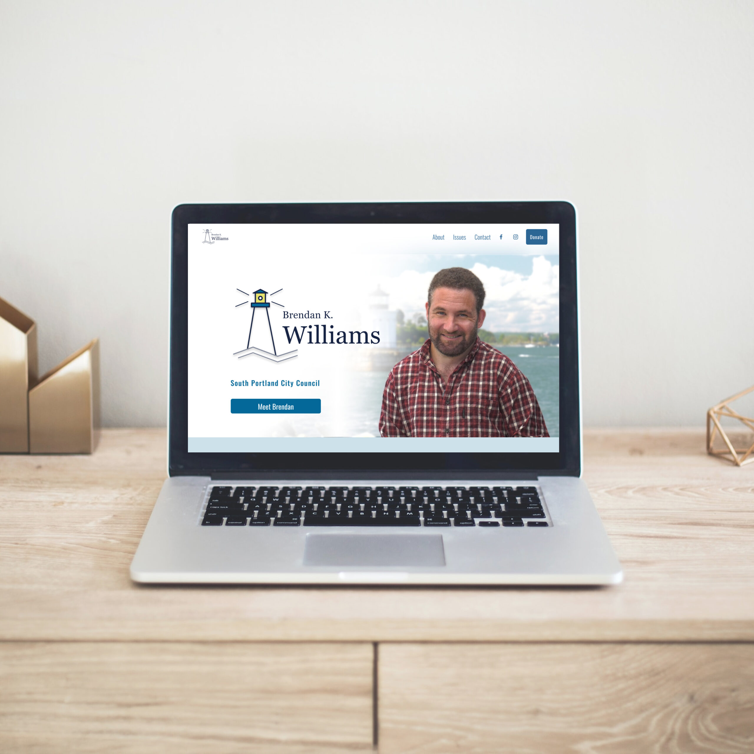
Political Candidate WebsiteWeb UX & Brand Design
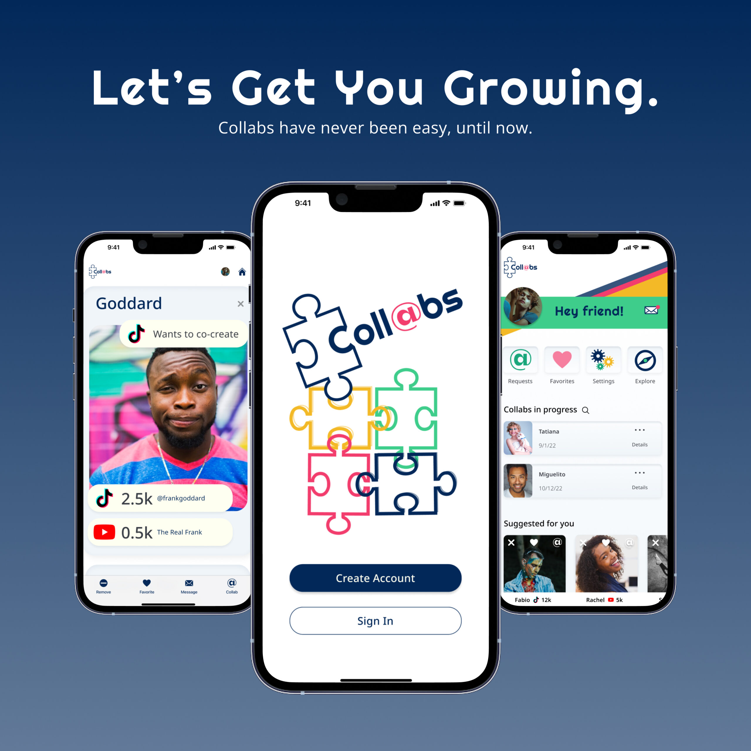
Collabs Mobile AppiOS Native UX & Brand Design
Julia Workman
Product Designer
Portland, ME, USA
workmanjulia@gmail.com
LinkedIn
© Julia Workman 2023
UX design portfolio