
Navigate Portland Project: Logo Design
by Julia Workman
Project Type: Logo design
Client: Portland Arts Guild
Year: 2022 (4 weeks)
My Roles: Graphic designer
Tools: Pen and paper, Procreate, Figma
BACKGROUND
How might we design a logo that captures the essence of Portland, Maine in a unique way?
The Portland Arts Guild is a small, student-led initiative to incorporate art into the infrastructure of Portland, Maine. They have successfully fundraised for art installations and aesthetic improvements to public spaces in the past.
When they contacted me, they were launching a project titled Navigate Portland, with the goal to create a set of beautiful navigational signs for the city, featuring a unique logo that would encapsulate the spirit of Portland.
For those who don't know, the imagery associated with Maine (nicknamed "Vactionland" for its booming tourism economy), is pretty well-established: lobsters, pine trees, lighthouses, and maybe a moose or a blueberry. These images have been used and re-used for decades; they are our equivalent to using an image of the Eiffel tower to represent Paris.
The goal was to create a logo that avoided cliched imagery, but still represented Maine and the city of Portland.
While walking the city's brick sidewalks, I came up with 3 possibilities for unique Portland-focused imagery.
- Fog (the ocean's best friend)
- Seagulls (they're everywhere)
- Brick (it's everywhere)
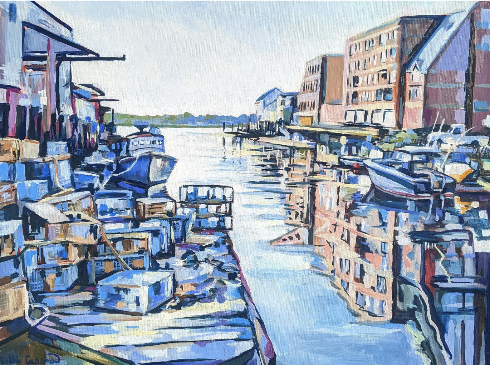
Painting of Portland, Maine by Collin Cessna
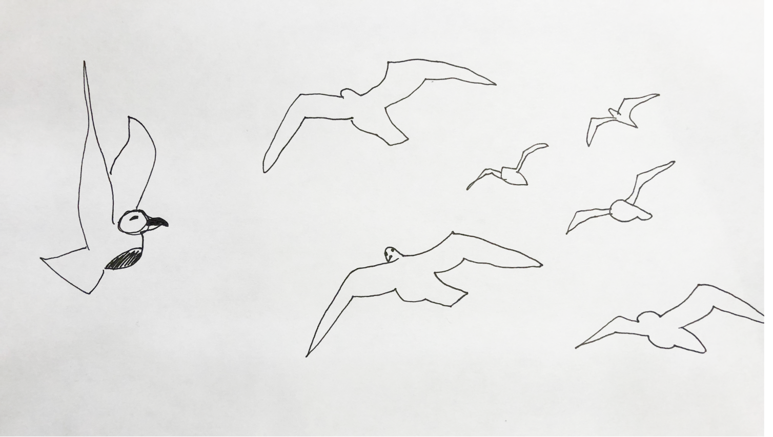
CONCEPT SKETCHES
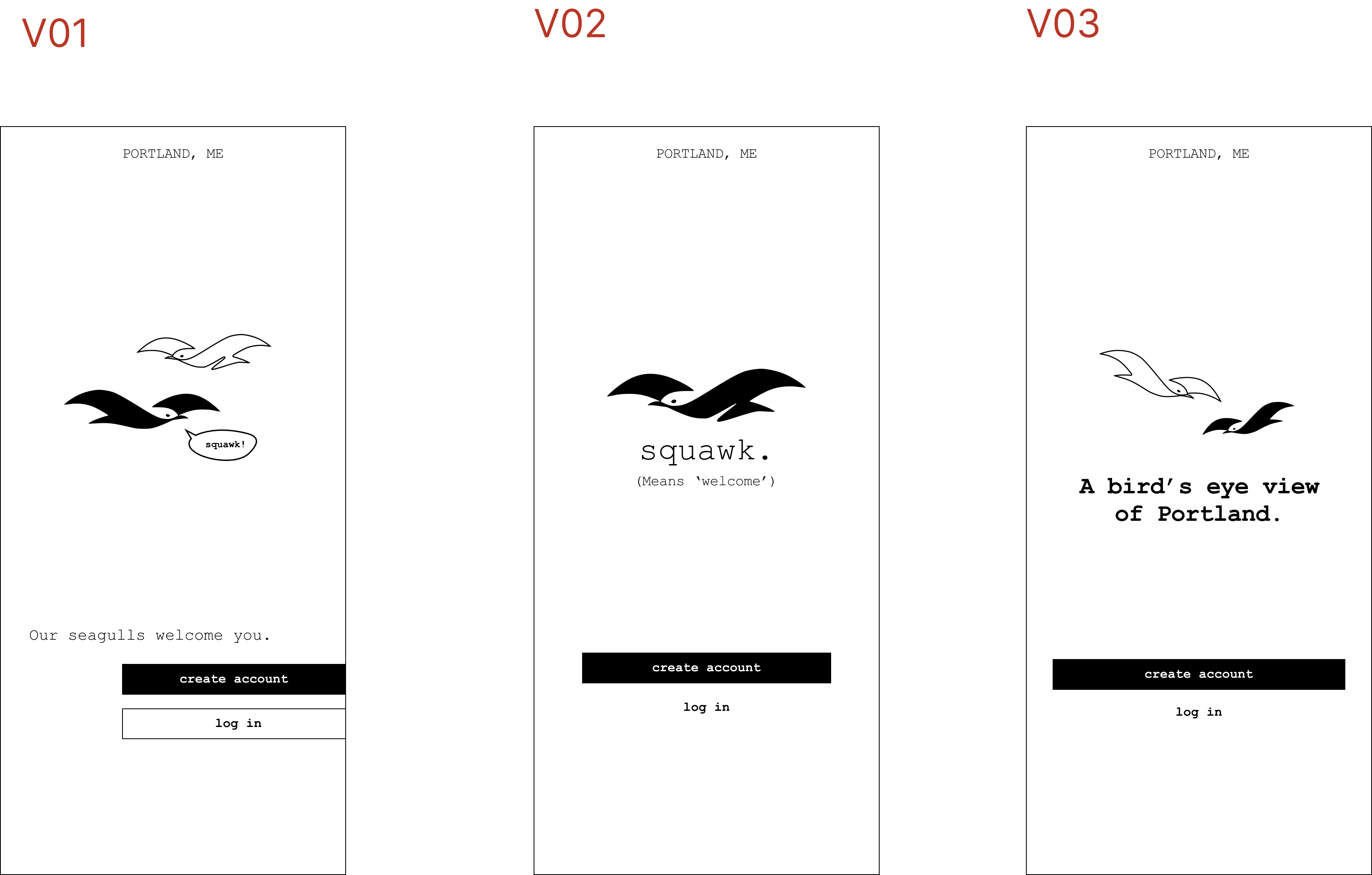
Clients chose the seagull, and I iterated on simple, recognizable bird silhouettes.
Everyone who spends more than a few hours in Portland is sure to encounter seagulls, and possibly become overwhelmed by them- these scrappy birds are known for stealing food, squawking loudly at all hours of the day, and even relieving themselves on peoples' heads.
Desite the annoyances, seagulls provide a constant reminder of the beauty of the nearby ocean, and thus, many Portlanders have a love-hate relationship with the birds.
Street signs are meant to be read at a glance, or while moving quickly. In order to make sure the design was impactful in such a context, I aimed to remove as much detail from the final design as possible.
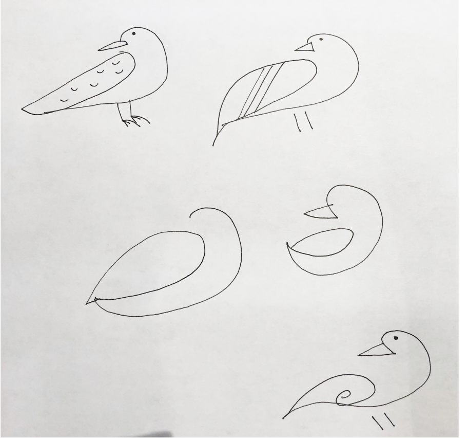
FINALISTS
Two versions of a simple, readable seagull shape were selected.
The clients wanted me to experiment with using these two versions in designs and mock-ups before deciding which version would represent their campaign.

STREET SIGN CONCEPTS
I experimented with typography and scalability.
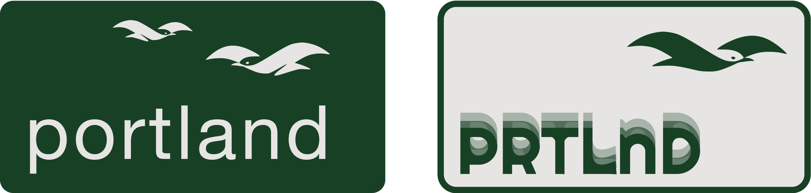
In the design on the left, I experimented with the scalability of Version 1, to see how the stripe at the belly would read in small sizes.
In the design on the right, I experimented with bringing in a visual representation of fog around the letters, evoking the image of a bird flying above a misty sea. I also created a wordmark using only the consonants from "Portland," which, in informal tests, was sufficiently readable.
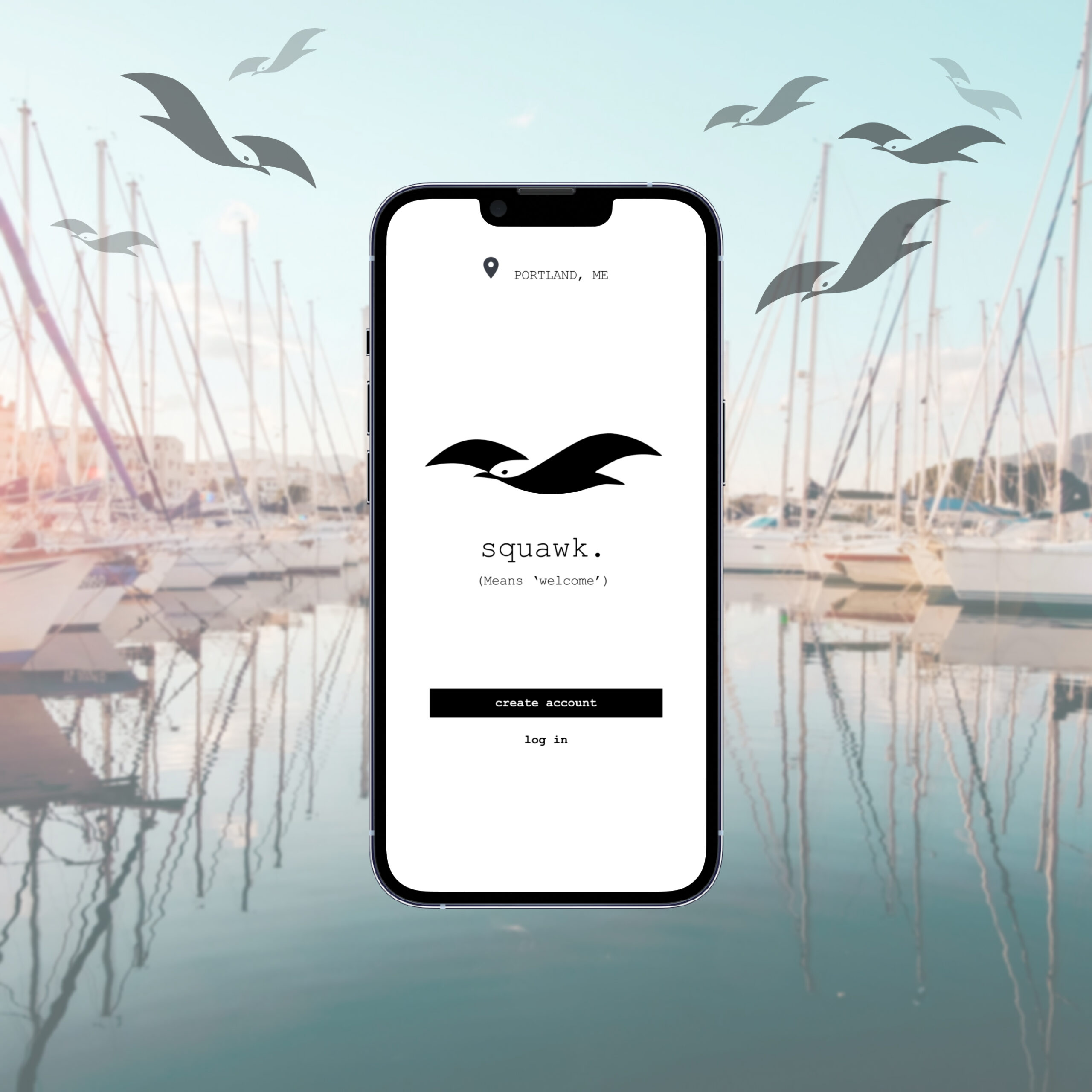
UI CONCEPTS (BRAINSTORMING)
Portland has a surging population of part-time residents, as well as a heavy year-round tourism economy.
While the City of Portland has an app that's made for permanent residents, there is an opportunity for a product made to serve Portland's many short-term residents and tourists.
For fun, I made some quick sketches of a visual identity concept for an app:
Thank You For Reading!
Design Projects
EdTech: Accessible Icon DesignAndroid Native UX Design
Navigate Portland: Logo DesignGraphic Design
Beyond Plus for Canada GooseMobile Web UX Design
Political Candidate WebsiteWeb UX & Brand Design
Collabs Mobile AppiOS Native UX & Brand Design
Julia Workman
Product Designer
Portland, ME, USA
workmanjulia@gmail.com
LinkedIn
© Julia Workman 2023
UX design portfolio